Overview
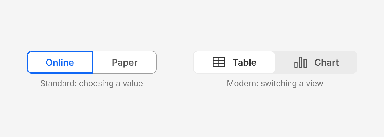
Use a toggle group to let people choose from 2 to 6 options that are all visible at once. It works as a single choice, like radio buttons, or a multiple choice, like checkboxes. It can also switch between views of the same content, such as a table or a chart of a class's results.
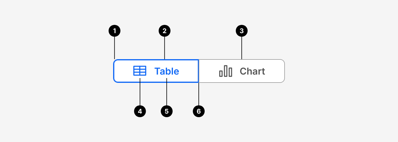
| # | Part | Description |
|---|---|---|
| 1 | Group | ToggleGroup.Root. Holds the buttons and sets the selection type, orientation, gap and theme. 8px outer corners. |
| 2 | Selected button | ToggleGroup.Button that is on. Standard: blue (primary-800) label and a 2px border. Modern: white background. |
| 3 | Unselected button | ToggleGroup.Button that is off. Standard: grey-600 border and grey-800 label. |
| 4 | Icon (optional) | An Icon child. Sized to match the button automatically. |
| 5 | Label | One or two words, in sentence case. |
| 6 | Divider | 1px grey-600 line between merged buttons. Hidden next to a selected or hovered button. |
Do's and Don'ts
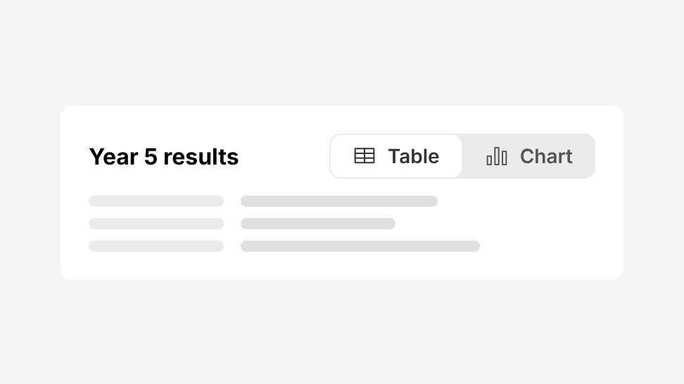
Do
Switch between views of the same content, such as a class's results as a table or a chart.
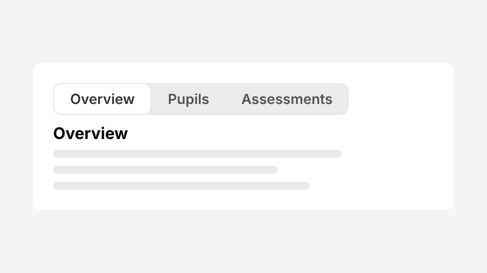
Don't
Navigate between pages or sections. Use Tabs or Navigation Menu instead.
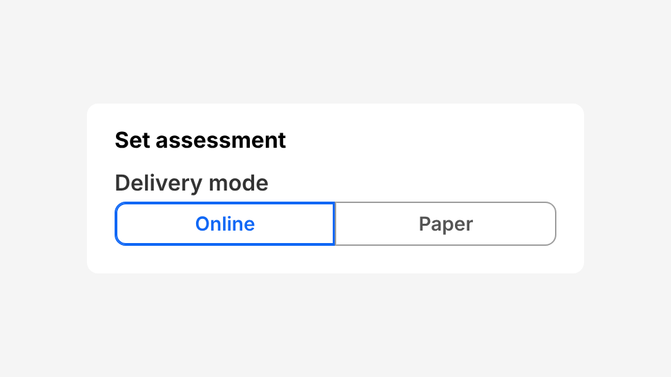
Do
Choose one value in a form, like radio buttons, such as the delivery mode when setting an assessment.
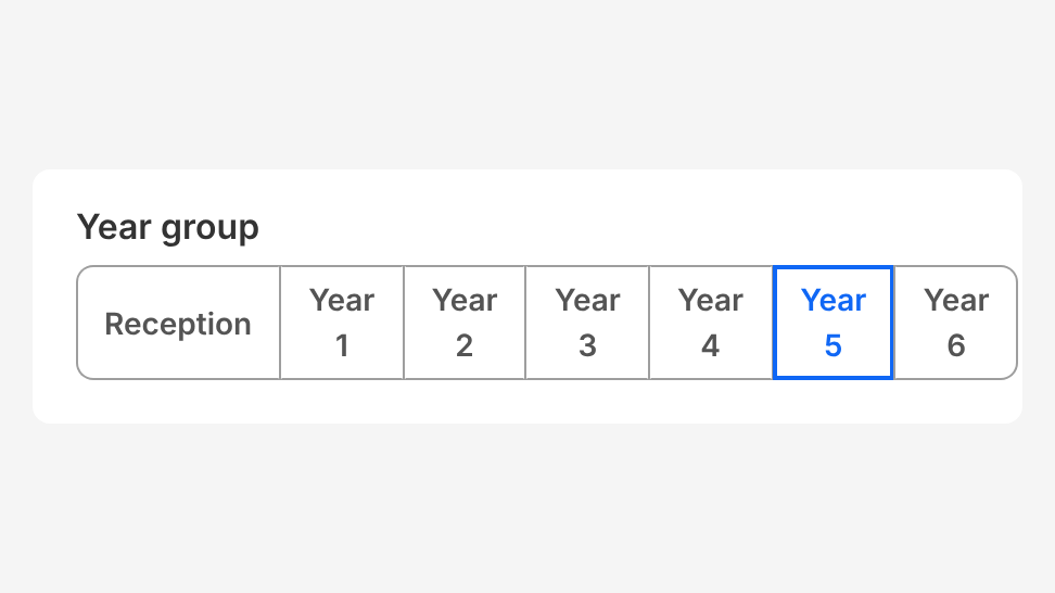
Don't
Use more than 6 options. Use Radio Button, Checkbox Group or Select instead.
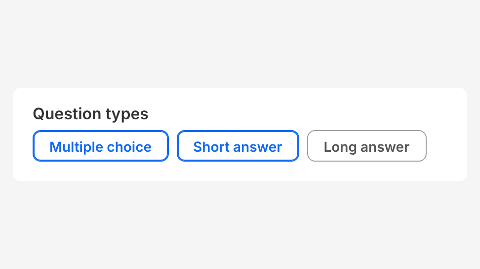
Do
Choose several values, like checkboxes, such as the question types to include.
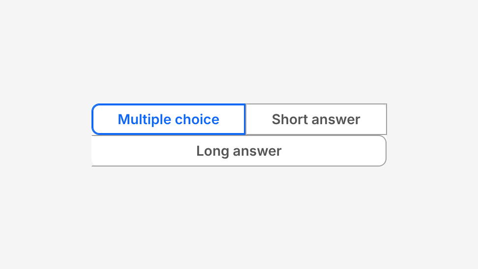
Don't
Wrap a merged group onto more than one row.
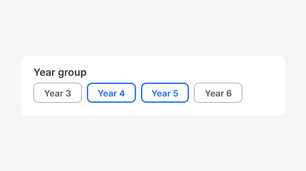
Do
Filter a list by a small set of values, such as year group.
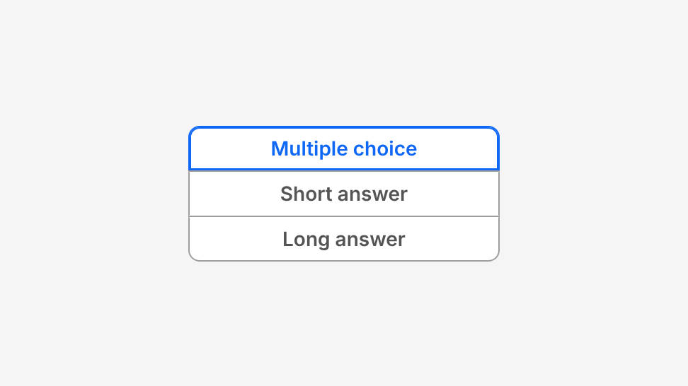
Do
Display a merged group vertically when it doesn't fit on one row.
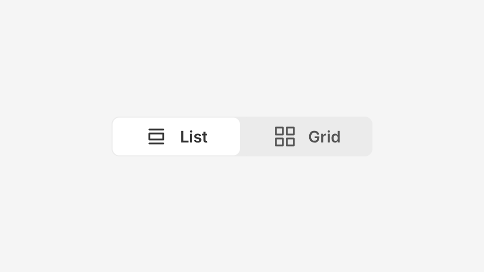
Do
Combine an icon with a label to reinforce it.
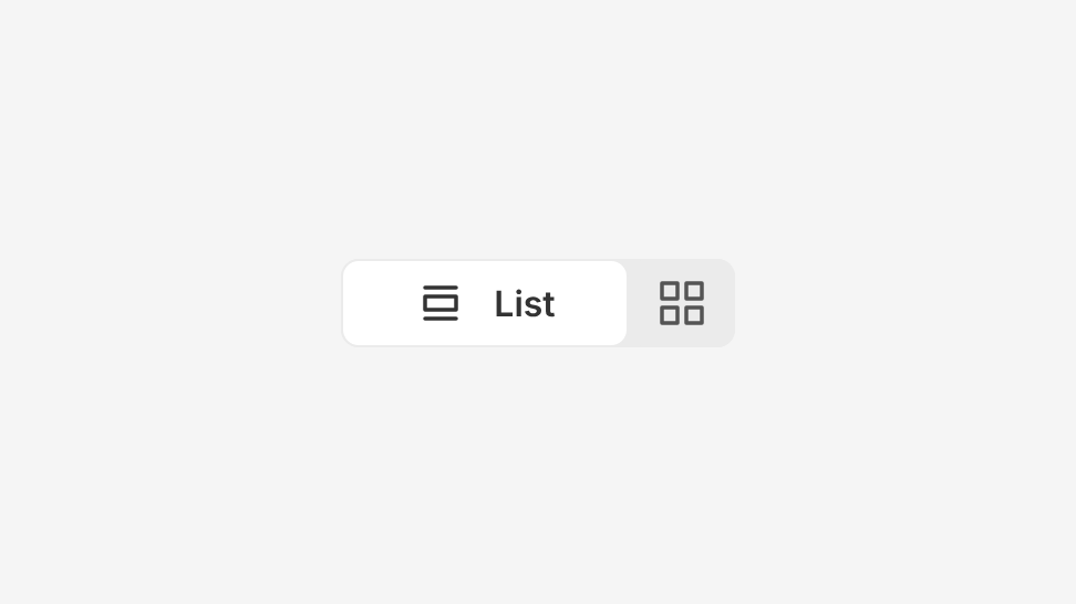
Don't
Mix icon-only and labelled buttons in the same group.
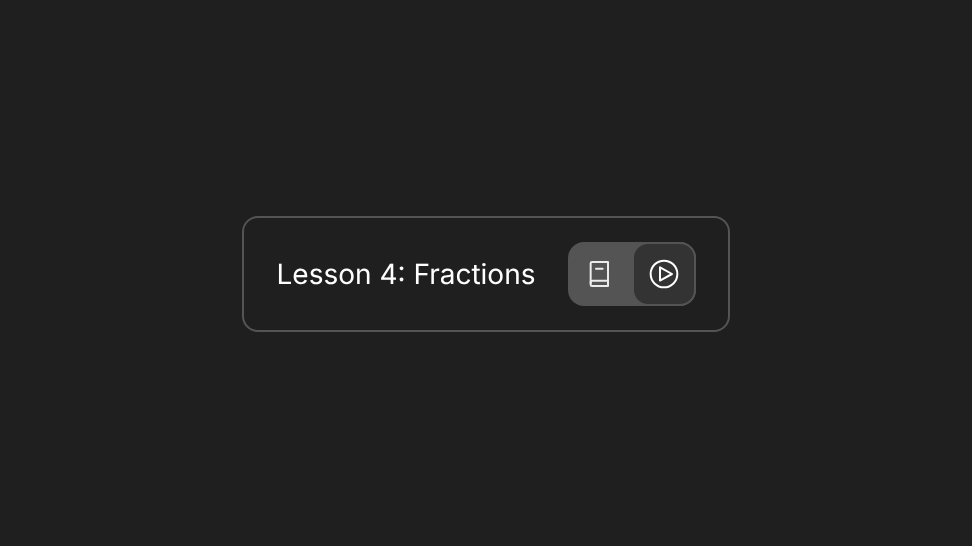
Do
Use icon-only xs buttons with colorMode="dark" on dark toolbars, such as switching between notes and video in a lesson.
Choosing a selection type
- Single (
type="single"): one option at a time, like radio buttons. Choosing an option deselects the others. - Multiple (
type="multiple"): any number of options, like checkboxes. Each button turns on and off without changing the others.
Default selection. A view switch always starts with an option selected and uses disableDeselect, so there is always a view showing. A choice in a form can start empty, like radio buttons.
Choosing a theme
- Standard (default): use it to choose a value, in forms and filters.
- Modern: use it to switch between views or modes of the same content.
Layout
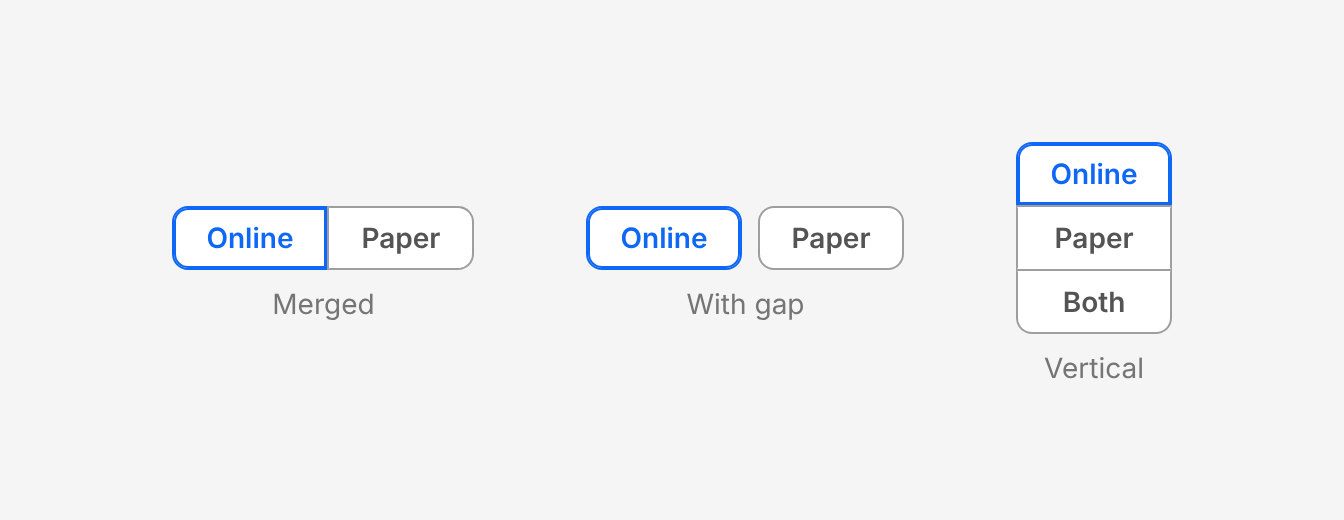
- Merged (default, no
gap): use it for short groups that fit on one row. - With gap (
gap={0–3}): use it for longer labels, filters, or any group that needs to wrap (wrap). - Vertical (
orientation="vertical"): use it when a merged group doesn't fit on one row. Never wrap a merged group.
Use isFullWidth in narrow forms and on mobile, so the buttons share the full width equally.
Size
Heights match Button, so use the same size as any buttons next to the group. Use md (default) in most places, sm in dense areas such as table toolbars, and lg only next to large buttons. Use xs for compact icon-only buttons, such as dark toolbars. Use one size for every button in a group.
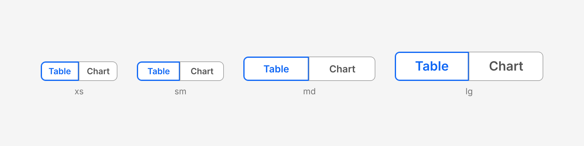
| Size | Height | Label | Icon |
|---|---|---|---|
| xs | 32px | 14px | 16px |
| sm | 32px | 14px | 16px |
| md | 40px | 16px | 24px |
| lg | 48px | 21px | 32px |
xs differs from sm only in having less horizontal padding (12px instead of 16px). In the Modern theme it also makes icon-only buttons narrower (32px instead of 40px).
Labels and icons
- Use one or two words, in sentence case, with no full stop.
- Keep labels on one line. If they wrap, shorten them, use a gap, or display the group vertically.
- An icon can sit next to a label to reinforce it, or replace the label to save space.
- In a group, make every button icon-only or every button labelled. Don't mix them.
Dark surfaces
On dark (grey-1000) surfaces, set colorMode="dark". It works with both themes.
Accessibility
- Name the group. Give
ToggleGroup.Rootanaria-label, or pointaria-labelledbyat its visible label. A visible label isn't linked automatically. - Name icon-only buttons. Give each icon-only button an
aria-label. A tooltip is optional. - Selection isn't shown by colour alone. Standard selected buttons get a thicker border, and Modern selected buttons get a white background. Don't override these styles.
- Keyboard. Tab moves into and out of the group. Arrow keys move between buttons. Space or Enter toggles the focused button.
- Announced as. A single group is announced as a radio group, with each button as a radio. In a multiple group, each button is announced as a toggle button, pressed or not pressed.
Options
| Option | In code | Values | Default |
|---|---|---|---|
| Selection type | type | single, multiple | Required |
| Theme | theme | standard, modern | standard |
| Colour mode | colorMode | light, dark | light |
| Orientation | orientation | horizontal, vertical | horizontal |
| Gap | gap | None (merged), 0, 1, 2, 3 | None |
| Wrap | wrap | true, false. Only with a gap. | false |
| Full width | isFullWidth | true, false | false |
| Keep a selection | disableDeselect | true, false | false |
| Size | size on ToggleGroup.Button | xs, sm, md, lg. Can change by breakpoint. | md |
| Disabled | disabled on the group or a button | true, false | false |