
Overview
Use Textarea Field when people need to write several lines of text, such as notes about a pupil or a message to parents.
Anatomy
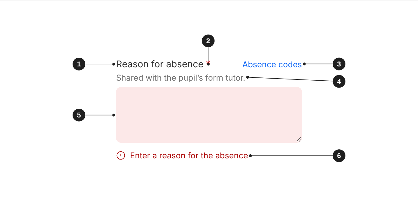
| # | Part | Description |
|---|---|---|
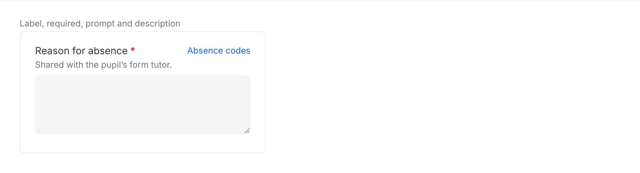
| 1 | Label | Says what to enter. Always visible, except in search, filter bars and table cells. |
| 2 | Required indicator | An asterisk, shown when validation.required is set. |
| 3 | Prompt (optional) | A link to a related action, at the right of the label. |
| 4 | Description (optional) | Format hints or context, between the label and the field. |
| 5 | Field | Where people type. At least 96px tall, and people can drag it taller. |
| 6 | Error message | Says what is wrong and how to fix it. Shown below the field. |
When to use
- Several lines or sentences: notes about a pupil, feedback, comments, messages.
When not to use
- A single line, such as a pupil's name or a class name: use Input Field.
- Formatted text with headings or lists: use a rich-text editor.
Content
- Use a concise label that says what to write, such as "Notes about this pupil". Don't repeat the dialog or page title.
- Use the
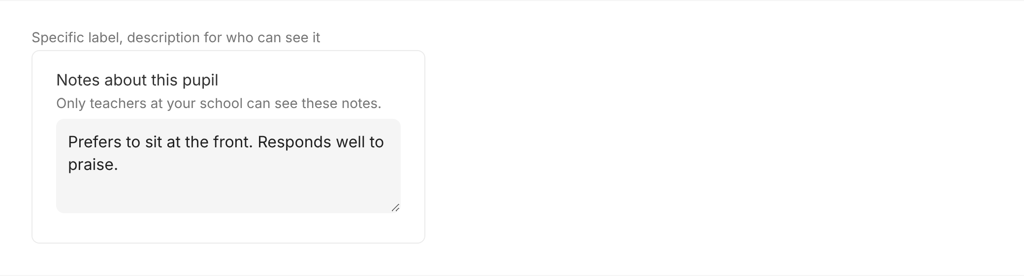
descriptionfor anything people need before they start, such as who can see what they write. - Keep the default minimum height, so a few lines are visible without scrolling. Don't make it shorter.
Appearance and theme
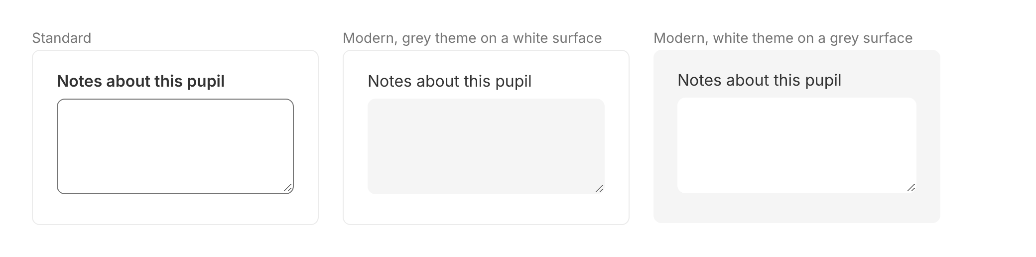
Use the modern appearance (appearance="modern") on new screens. It has a filled background and no border.
Use the standard appearance (the default in code) only when the background doesn't give the field enough contrast to pass accessibility, and the field needs a border to stand out. Standard has a white background and a grey-700 border.
For the modern appearance, pick the theme that contrasts with the surface behind the field:
theme="grey": on white surfaces, such as the page and dialogs.theme="white": on grey surfaces, such as grey panels and filter bars.
Set appearance and theme once on Form and every field inside follows them. Don't mix appearances in one form.
Size
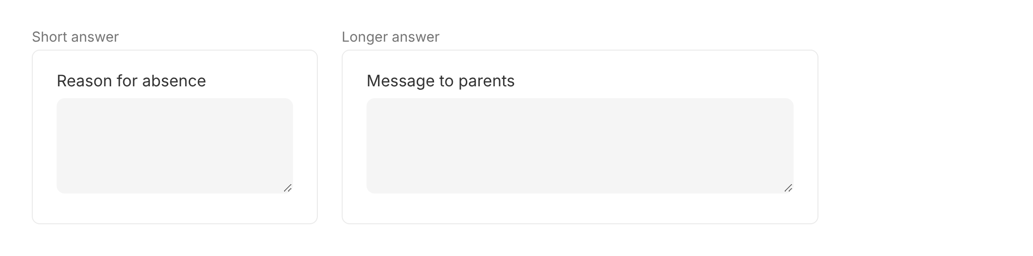
Textarea Field has no size. Set its width to suit the expected length of the answer.
Label and help text
- Label: always visible, short, and says what to enter ("Email address", not "Enter your email address here").
- Required: a required field shows an asterisk after its label. Add a line above the form: "Fields marked * are required".
- Description: put format hints and context people need before they type in
description. It sits between the label and the field. - Prompt: use
promptonly for a link to a related action, such as "Forgotten your password?". It sits at the right of the label. - Placeholder: use it only for an example value, such as "For example, prefers to sit at the front". Never put instructions or the label in the placeholder: it disappears as soon as people type.
Validation and errors
Errors appear when people leave the field, and again when they submit the form. An error clears as soon as the value is fixed. This is how Form behaves by default (validationMode="onBlur").
In the error state:
- Standard: the field border turns
danger, and the error message below the field isdanger. - Modern: the field background turns
dangerLightand its textdangerDark. The error message isdangerDark.
Write error messages that say what's wrong and how to fix it, such as "Enter a reason for the absence". Don't write "Invalid input" or "Error".

Disabled
People can't change a disabled field, and its value isn't sent with the form. If the reason isn't obvious, explain it in the description.

Accessibility
- Always give the field a label. The placeholder is never the label. With
hideLabel, the label is still read by screen readers. - Never rely on colour alone. Errors always come with a text message below the field.
- Mark required fields in text. Add "Fields marked * are required" above the form: the asterisk isn't read by screen readers.
- Explain disabled fields in the
descriptionwhen the reason isn't obvious.
Do's and Don'ts
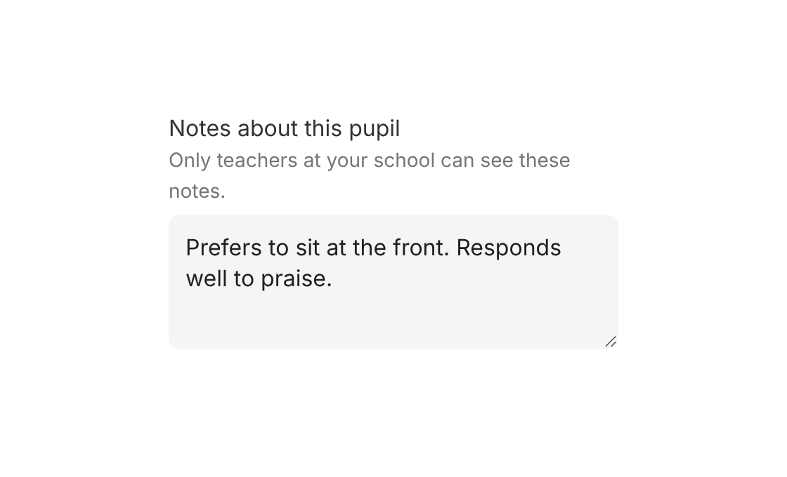
Do
Use a specific label, and a description for who can see the text.

Don't
Use a vague label such as "Enter text here".
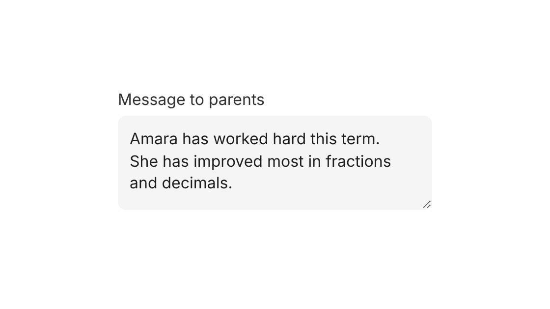
Do
Use it for several lines of text, such as notes about a pupil.
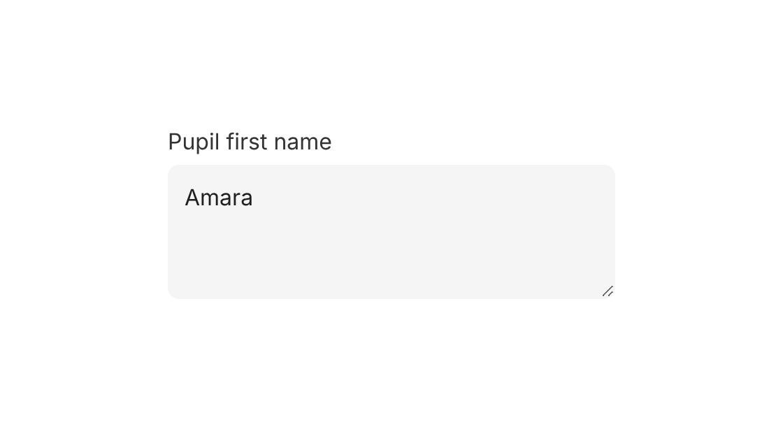
Don't
Use it for a single line, such as a pupil's name. Use Input Field instead.
Options
| Option | In code | Values | Default |
|---|---|---|---|
| Appearance | appearance | standard, modern | standard |
| Theme (modern only) | theme | grey, white | grey |
| Placeholder | placeholder | Text | None |
| Label | label | Text | Required |
| Hide label | hideLabel | true, false | false |
| Description | description | Text | None |
| Prompt | prompt | { label, link } or { label, onClick } | None |
| Validation | validation | required, pattern, min, max and other rules, each with a message | None |
| Disabled | disabled | true, false | false |