
Overview
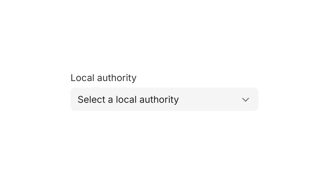
Use Select Field to choose one option from a very long list with the browser's own dropdown, such as a local authority or a school in a large trust.
Anatomy
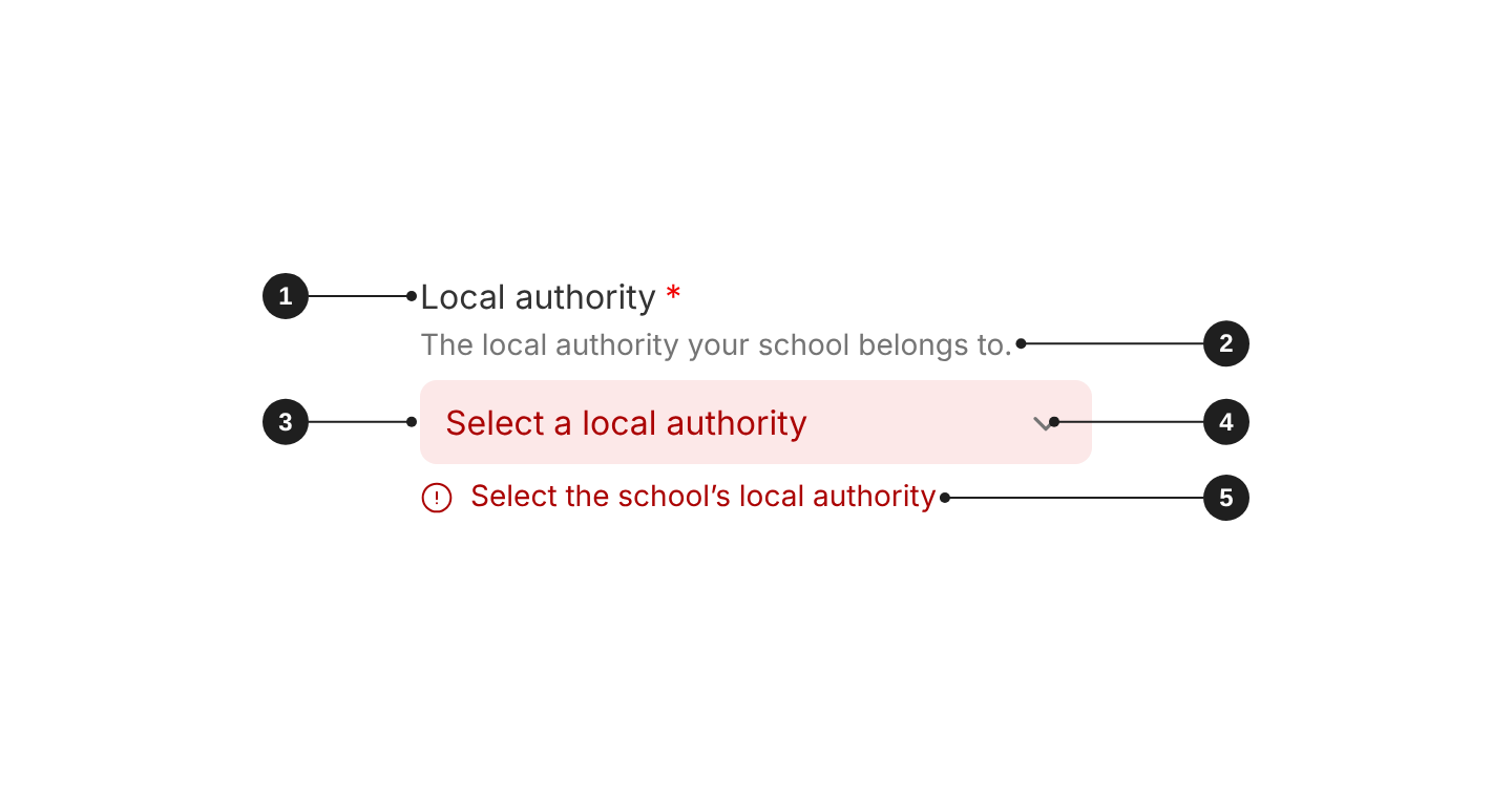
| # | Part | Description |
|---|---|---|
| 1 | Label | Says what to enter. Always visible, except in search, filter bars and table cells. |
| 2 | Description (optional) | Format hints or context, between the label and the field. |
| 3 | Field | Shows the selected option, or the placeholder. Opens the browser's own list. |
| 4 | Chevron | Shows that the field opens a list. |
| 5 | Error message | Says what is wrong and how to fix it. Shown below the field. |
When to use
- Very long lists, where the browser's native list and type-to-jump help: local authorities, schools in a large trust.
- Where the phone's native picker matters.
When not to use
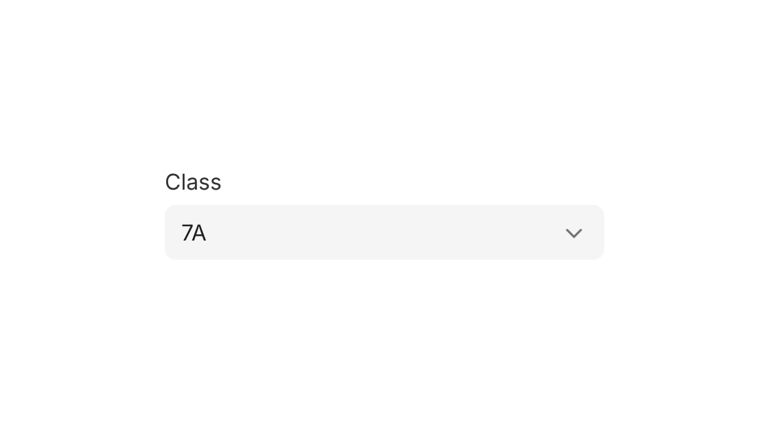
- Most choices, such as a class or year group: use Select Menu Field. It's the default for choosing one option.
- Long lists that people need to search: use Combobox.
- Actions or navigation: use Dropdown Menu.
Placeholder and options
- Add a
placeholdersuch as "Select a local authority", so no option is chosen by accident. It can't be chosen again once people pick an option. - Sort options in a way people expect: alphabetically, or in their natural order (Year 7, Year 8, Year 9).

Appearance and theme
Use the modern appearance (appearance="modern") on new screens. It has a filled background and no border.
Use the standard appearance (the default in code) only when the background doesn't give the field enough contrast to pass accessibility, and the field needs a border to stand out. Standard has a white background and a grey-700 border.
For the modern appearance, pick the theme that contrasts with the surface behind the field:
theme="grey": on white surfaces, such as the page and dialogs.theme="white": on grey surfaces, such as grey panels and filter bars.
Set appearance and theme once on Form and every field inside follows them. Don't mix appearances in one form.

Size
md(default, 40px): use it in forms.sm(32px): use it in dense tables and filter bars.lg(48px): use it on pupil-facing and sign-in screens.
Give fields in the same row the same size.

Label and help text
- Label: always visible, short, and says what to enter ("Email address", not "Enter your email address here").
- Required: a required field shows an asterisk after its label. Add a line above the form: "Fields marked * are required".
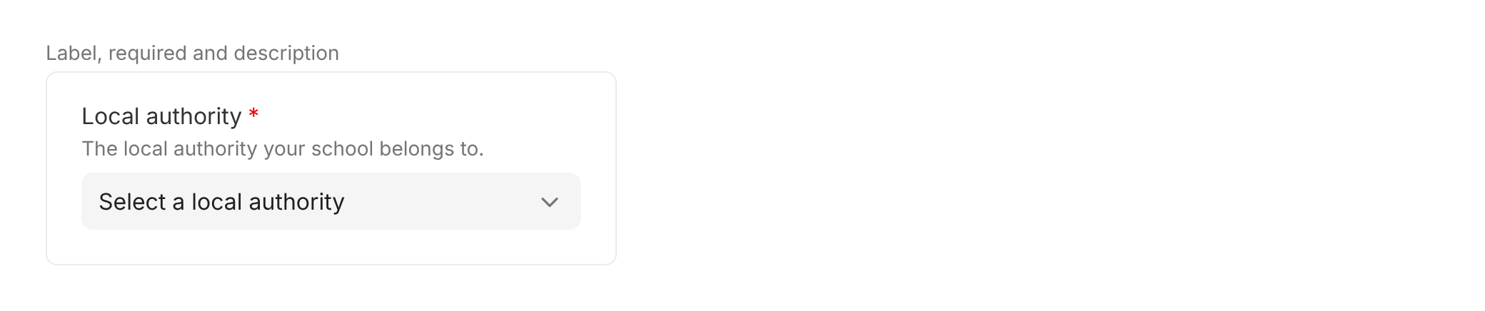
- Description: put format hints and context people need before they type in
description. It sits between the label and the field. - Prompt: use
promptonly for a link to a related action, such as "Forgotten your password?". It sits at the right of the label. - Placeholder: use it only to prompt a choice, such as "Select a local authority". Never put instructions or the label in the placeholder: it disappears as soon as people type.
Validation and errors
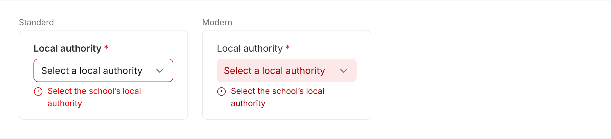
Errors appear when people leave the field, and again when they submit the form. An error clears as soon as the value is fixed. This is how Form behaves by default (validationMode="onBlur").
In the error state:
- Standard: the field border turns
danger, and the error message below the field isdanger. - Modern: the field background turns
dangerLightand its textdangerDark. The error message isdangerDark.
Write error messages that say what's wrong and how to fix it, such as "Select the school's local authority". Don't write "Invalid input" or "Error".
Disabled
People can't change a disabled field, and its value isn't sent with the form. If the reason isn't obvious, explain it in the description.

Accessibility
- Always give the field a label. The placeholder is never the label. With
hideLabel, the label is still read by screen readers. - Never rely on colour alone. Errors always come with a text message below the field.
- Mark required fields in text. Add "Fields marked * are required" above the form: the asterisk isn't read by screen readers.
- Explain disabled fields in the
descriptionwhen the reason isn't obvious.
Do's and Don'ts
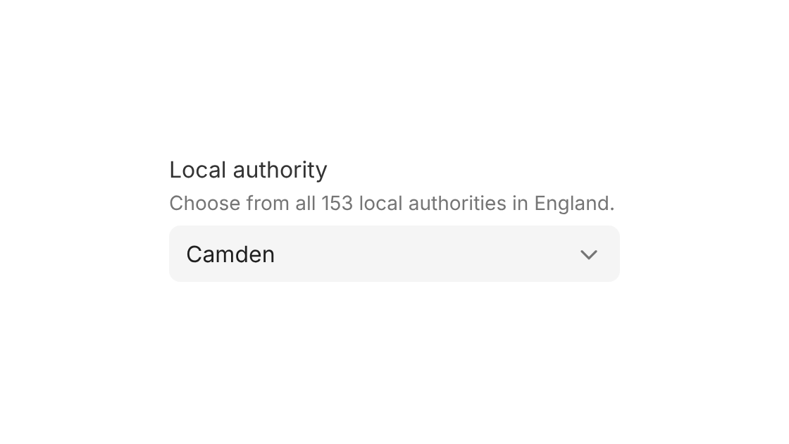
Do
Use it for very long lists, such as local authorities.
Don't
Use it for short lists, such as a class. Use Select Menu Field instead.
Do
Start with a placeholder that asks for a choice.
Don't
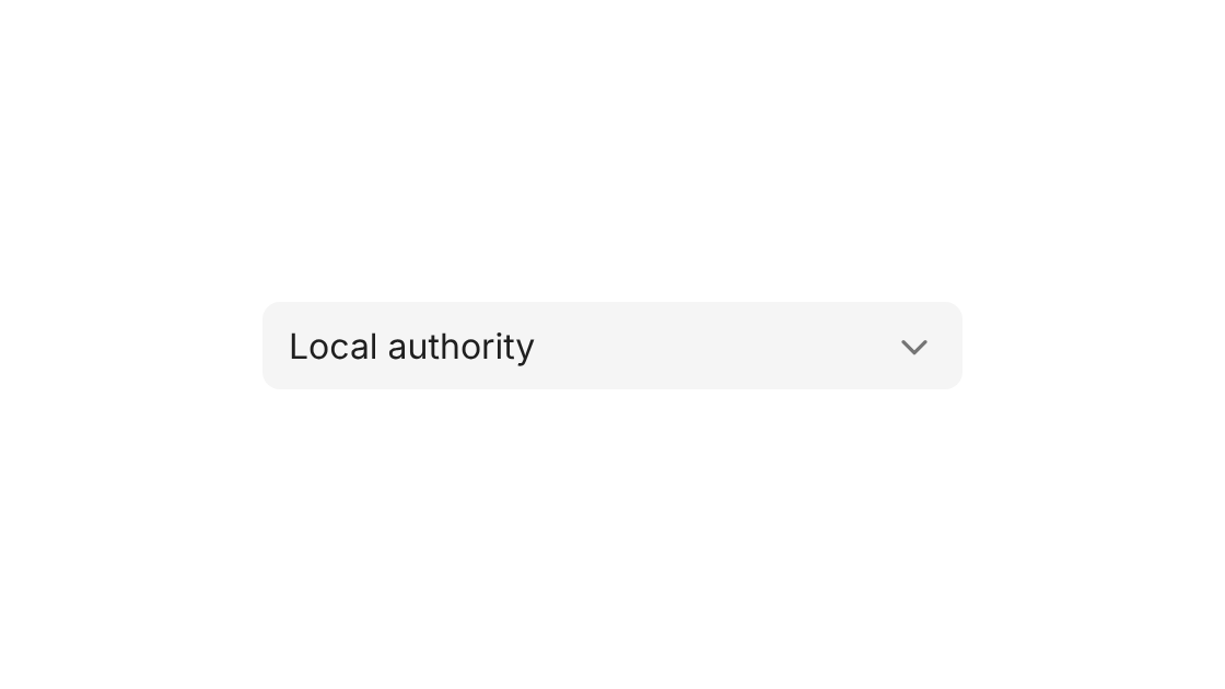
Use the first option as the label.
Options
| Option | In code | Values | Default |
|---|---|---|---|
| Appearance | appearance | standard, modern | standard |
| Theme (modern only) | theme | grey, white | grey |
| Size | size | sm, md, lg. Can change by breakpoint. | md |
| Placeholder | placeholder | Text | None |
| Options | children | <option> elements | None |
| Label | label | Text | Required |
| Hide label | hideLabel | true, false | false |
| Description | description | Text | None |
| Prompt | prompt | { label, link } or { label, onClick } | None |
| Validation | validation | required, pattern, min, max and other rules, each with a message | None |
| Disabled | disabled | true, false | false |