
Overview
Use a radio card to let people pick one option from a short set, when each option needs more than a short label: a description, a price or extra emphasis. For example, choosing whether a school follows A-levels or the IB Diploma, or choosing how a parent gets started with Atom Home.
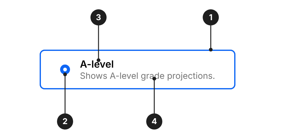
| # | Part | Description |
|---|---|---|
| 1 | Card | The whole card is clickable. Carries the appearance and theme. 8px corner radius. |
| 2 | Radio | Shows whether the option is selected. On the left by default, or on the right with align="right". |
| 3 | Title | The option's name. One line, in sentence case. |
| 4 | Description | Optional. One short line that explains the option. |
When to use
- Use Radio Card when people choose one option and each option needs a description, price, metadata or more emphasis.
- Use Radio Button Field when the options are short, simple labels.
- Use Checkbox Field when people can choose more than one option.
- Use Select Field when there are more than five options.
Do's and Don'ts
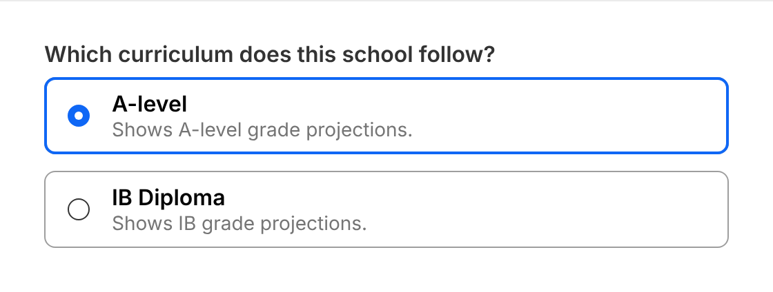
Do
Use radio cards when each option needs a short description, such as choosing between A-level and IB Diploma grade projections.
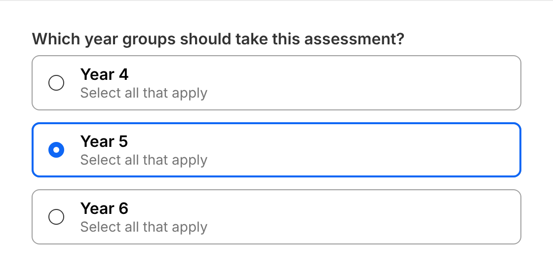
Don't
Use radio cards when people can choose more than one option. Use Checkbox Field instead.
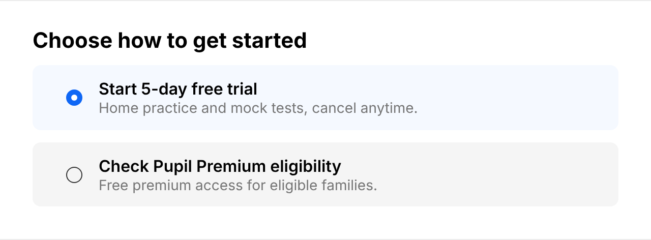
Do
Use the lg size when the choice is the main task on the page, such as choosing how to get started with Atom Home.
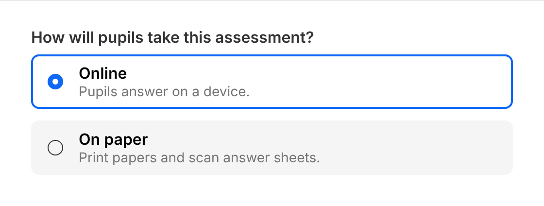
Don't
Mix standard and modern cards in one group or form.
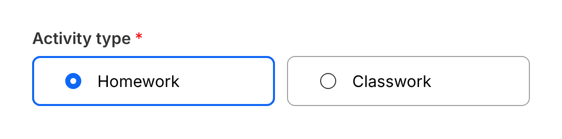
Do
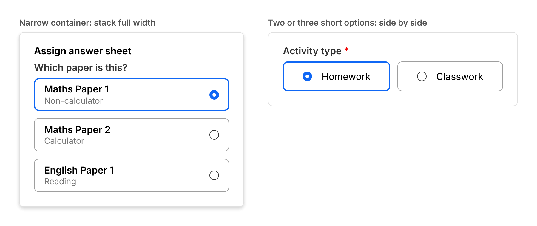
Place two or three short options side by side, such as choosing between homework and classwork.
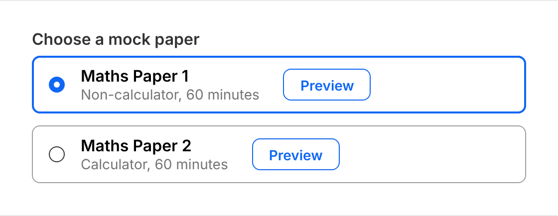
Don't
Put links, buttons or inputs inside a card. The whole card is the control.
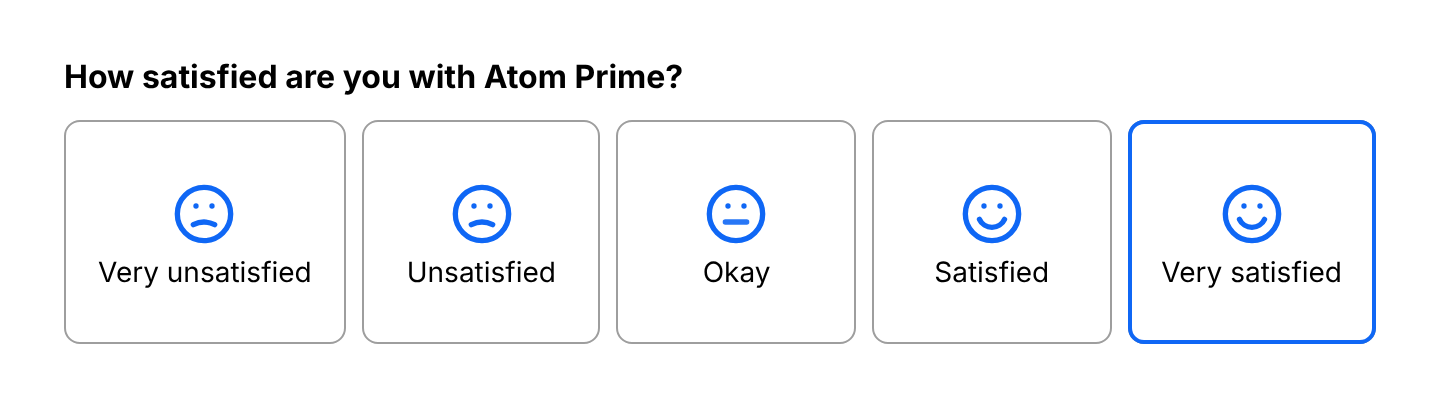
Do
Use radio cards for a short rating scale. You can hide the radio on an illustrated scale, as long as the selection is shown by more than colour.
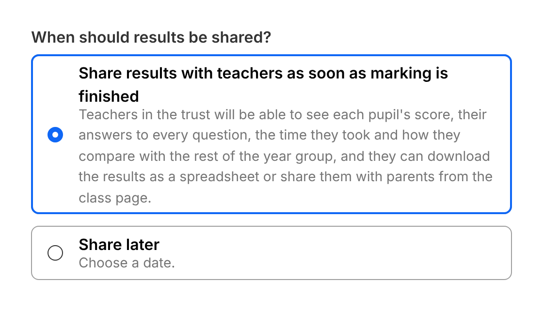
Don't
Write paragraphs in a card. Keep to a title and one short line of description.
Choosing an appearance
Use the same appearance as the other form fields on the screen.
- Standard (default): white card with a
grey-600border. Use it alongside standard inputs. - Modern: borderless. Use it alongside modern inputs, and choose the theme for the surface it sits on:
greytheme (default) on white surfaces.whitetheme on grey surfaces.
Never mix appearances in one group or form.
<div className="flex flex-col gap-6 rounded-md bg-white p-6">
  <RadioCardGroup appearance="standard" defaultValue="1">
    <RadioCard value="1">Standard</RadioCard>
    <RadioCard value="2">Standard</RadioCard>
  </RadioCardGroup>
  <RadioCardGroup appearance="modern" theme="grey" defaultValue="1">
    <RadioCard value="1">Modern, grey theme</RadioCard>
    <RadioCard value="2">Modern, grey theme</RadioCard>
  </RadioCardGroup>
  <div className="bg-grey-100 p-4">
    <RadioCardGroup appearance="modern" theme="white" defaultValue="1">
      <RadioCard value="1">Modern, white theme</RadioCard>
      <RadioCard value="2">Modern, white theme</RadioCard>
    </RadioCardGroup>
  </div>
</div>
Size
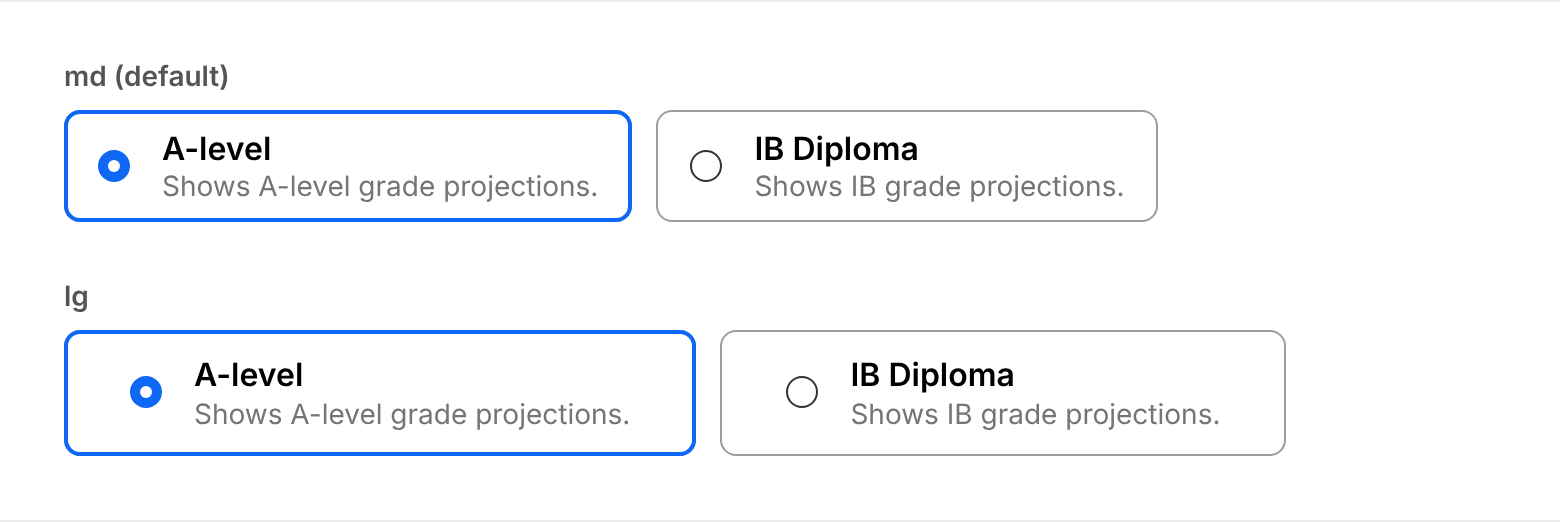
md(default): use it in forms and modals.lg: use it when the choice is the main task on the page, such as an onboarding or upsell step.
Use the same size for every card in a group.
Layout
- Use two to five options. For more, use Select Field.
- Stack cards full width (
isFullWidth) in narrow containers, such as modals and on mobile. Place cards side by side only for two or three short options. - Keep every card in a group the same. Set
size,align,isFullWidth,appearanceandthemeonRadioCardGroup, not on each card.
Content
- Start with a clear title in sentence case, then one short line of description if it helps people choose.
- Don't put links, buttons or inputs inside a card. The whole card is the control, so anything interactive inside it can't be reached properly.
States
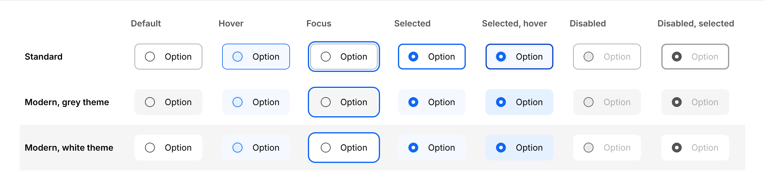
| State | Standard | Modern |
|---|---|---|
| Default | White, 1px grey-600 border | grey-100 (grey theme) or white (white theme), no border |
| Selected | 2px primary-800 outline, filled radio | primary-100 background, filled radio |
| Hover | primary-100 background, primary-800 border, halo behind the radio. Selected: primary-900 outline | primary-100 background, halo behind the radio. Selected: primary-200 background |
| Focus | 2px white and 4px primary-800 ring | 2px white and 4px primary-800 ring |
| Disabled | Content at 30% opacity, grey radio. Selected: grey-600 outline | Content at 30% opacity, grey radio, theme background |
Accessibility
- The card text is the label. Everything inside the card is read out as the option's name. Keep it short, and hide decorative content, such as illustrations or prices repeated elsewhere, with
aria-hidden. - Keyboard. Tab moves into the group, and the arrow keys move between options and select them. This is built in: don't add your own key handlers or click actions to the cards.
- Don't rely on colour alone. The filled radio shows which option is selected, as well as the colour change, so don't hide it. The only exception is an illustrated rating scale, and only when the selection is still clear from more than colour, for example the 2px outline of the standard appearance.
Structure and spacing
| Property | Token | px | rem |
|---|---|---|---|
| Border radius | radius-md | 8px | 0.5 |
| Border (standard) | grey-600 | 1px | - |
| Selected outline (standard) | primary-800 | 2px | - |
| Padding x - md | space-4 | 16px | 1 |
| Padding y - md | space-3 | 12px | 0.75 |
| Padding x - lg | space-8 | 32px | 2 |
| Padding y - lg | space-4 | 16px | 1 |
| Radio size | - | 16px | 1 |
| Radio to content gap | space-4 | 16px | 1 |
| Gap between cards | space-3 | 12px | 0.75 |
Typography
Radio Card has no text styles of its own: it renders what you put inside it. Match the design system's radio card:
| Part | Component | Size | Weight | Colour |
|---|---|---|---|---|
| Title | Text | md | 600 | grey-900 |
| Price | Text | sm | 400 | grey-800 |
| Description | Text | sm | 400 | grey-700 |
Options
| Option | In code | Values | Default |
|---|---|---|---|
| Appearance | appearance | standard, modern | standard |
| Theme | theme | grey, white (modern only) | grey |
| Size | size | md, lg | md |
| Radio side | align | left, right | left |
| Full width | isFullWidth | true, false | false |
| Disabled | disabled | On a card or the whole group | false |