
Overview
Use a radio button when someone must choose exactly one option from a small set, such as how pupils will take an assessment.
In product UI, use Radio Button Field. It adds the group label, description and error message. Use RadioButton and RadioButtonGroup directly only to build a new field-type component.

| # | Part | Description |
|---|---|---|
| 1 | Radio button | The control. A 16px circle, filled in the primary colour when selected. |
| 2 | Label | The option. Clicking it selects the option. |
When to use
- Someone must choose exactly one option.
- The choice is confirmed by submitting a form, not applied straight away.
When not to use
| Situation | Use instead |
|---|---|
| People can choose more than one option | Checkbox Group |
| 6 or more options | Select or Select Menu |
| The choice applies straight away, like switching a results view | Segmented Control or Tabs |
| A single on/off setting | Checkbox or Switch |
| Options need a description or image to compare | Radio Card |
Do's and Don'ts

Do
Use radio buttons when people must choose exactly one option from a small set.
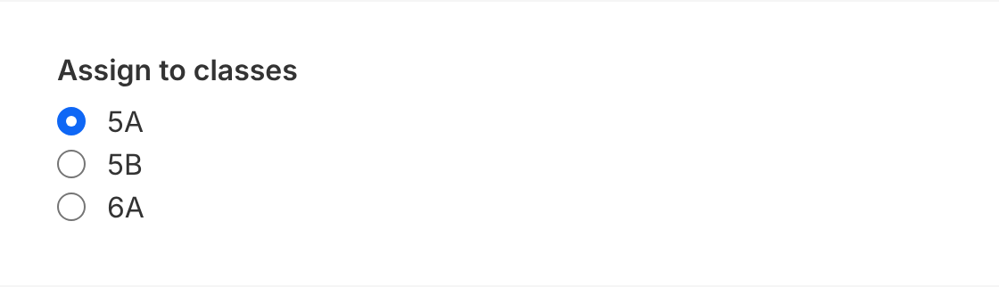
Don't
Use radio buttons for multi-select, when people can choose more than one option, like assigning several classes. Use Checkbox Group instead.

Do
Order options logically, here from the narrowest to the widest audience, and preselect the safest one.

Don't
Order options randomly or alphabetically when a natural order exists.

Do
Stack options vertically, with one option per line.
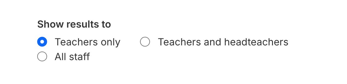
Don't
Lay options out horizontally when labels vary in length. It's hard to scan, and it breaks on mobile and at 200% zoom.
Default selection
Preselect an option when there's a sensible, low-risk default, for example "Teachers only" for who can see results. Leave the group empty when the choice must be deliberate, for example a marking scheme or consent, and make it required.
Once an option is selected, people can't clear it. If "none" is a valid answer, add it as an option.
Layout
- Stack options in a column (default). It's the easiest to scan.
- Use a row only for 2 or 3 short labels, such as "Online" and "On paper". Don't use a row on narrow, mobile-width layouts.
Size
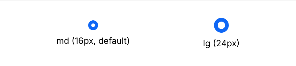
Use md (16px, default) in teacher and admin tools. Use lg (24px) only on pupil-facing screens, such as answering a question.
States

| State | Appearance |
|---|---|
| Unselected | 1px grey-700 border, transparent fill |
| Selected | primary-800 fill and border, white dot |
| Focus (keyboard) | 2px white gap and 4px primary-800 ring. Shown for keyboard focus only. |
| Disabled | grey-200 fill, 1px grey-700 border, not-allowed cursor |
| Disabled selected | grey-200 fill, 1px grey-700 border, grey-600 dot (same size as enabled) |
Labels
- Write labels in sentence case, with no punctuation at the end.
- Keep them short and parallel: each one should answer the legend's question.
- Order options logically: by frequency, by size, or from narrowest to widest.
Accessibility
- Always label the group and every option. In product UI,
RadioButtonFielddoes this with alegendand a label per item. When composing your own, give theRadioButtonGroupanaria-labeland eachRadioButtona visible label oraria-label. - Keyboard. Tab moves into the group, onto the selected option (or the first one). Arrow keys move between options and select them. Tab again leaves the group.
- Focus is always visible. The focus ring is a 2px white gap and a 4px
primary-800ring, with a transparent outline so it still shows in Windows High Contrast mode. - Don't rely on colour alone. The selected state is shown by the dot as well as the fill colour.
- Make the label clickable. Use
InlineFieldWrapper(orRadioButtonField.Item) so the whole label is a target, not just the 16px circle.
Structure and spacing
| Property | Token | px | rem |
|---|---|---|---|
| Size - md | size-4 | 16px | 1 |
| Size - lg | size-6 | 24px | 1.5 |
| Dot - md | size-1.5 | 6px | 0.375 |
| Dot - lg | size-3 | 12px | 0.75 |
| Border | grey-700 | 1px | - |
| Border radius | full | - | - |
| Gap between items (row) | space-8 | 32px | 2 |
| Focus ring - gap | white | 2px | - |
| Focus ring - ring | primary-800 | 4px (2px visible) | - |
Options
| Option | In code | Values | Default |
|---|---|---|---|
| Size | size on RadioButton | md, lg. Can change by breakpoint. | md |
| Direction | direction on RadioButtonGroup | row, column | None (RadioButtonField uses column) |
| Disabled | disabled | On one RadioButton or the whole group | false |
| Default | defaultValue on the group | Any option's value | None |