
Overview
Use Number Input Field for a small whole number that people usually change by a few steps from a sensible default, such as the number of pupils per group. People can press − and +, or type the number.
Anatomy
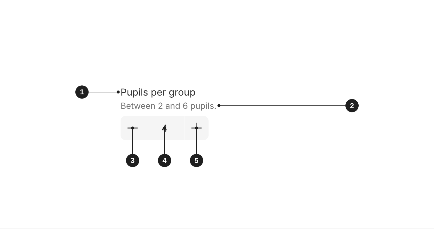
| # | Part | Description |
|---|---|---|
| 1 | Label | Says what to enter. Always visible, except in search, filter bars and table cells. |
| 2 | Description (optional) | Format hints or context, between the label and the field. |
| 3 | Decrement button | Lowers the value by step. Disabled at min. |
| 4 | Value | The current number. People can also type it. |
| 5 | Increment button | Raises the value by step. Disabled at max. |
When to use
- Small ranges, from 0 to about 10, where people move a few steps from the default: pupils per group, number of attempts, questions per page.
When not to use
- Large ranges or values far from any default, such as marks out of 100 or the number of pupils in a year group: use Input Field with
type="number". - Two or three fixed choices: use Segmented Control or Radio Button Field.
- Yes or no settings: use Switch or Checkbox Field.
Default, range and step
- Always start from a sensible default, usually the most common value. In code it's
0unless you setdefaultValue. - Set
minandmaxwhenever the range is known. People can't go past them with the buttons. - Say the range in the
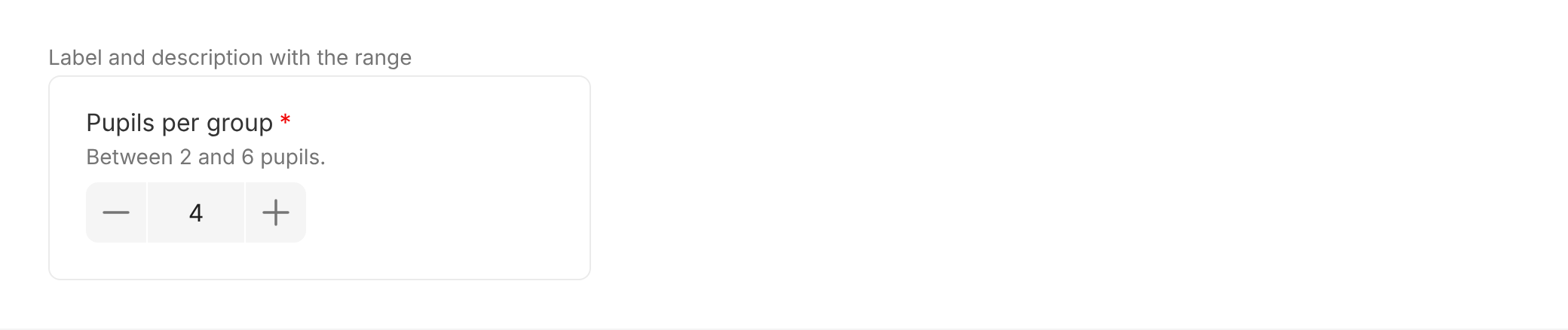
description, such as "Between 2 and 6 pupils". - At the limit, the disabled button shows a tooltip. Replace the default ("Cannot enter values above 6") with a reason in plain words, using
disabledTooltipContent.
Appearance and theme
Use the modern appearance (appearance="modern") on new screens. It has a filled background and no border.
Use the standard appearance (the default in code) only when the background doesn't give the field enough contrast to pass accessibility, and the field needs a border to stand out. Standard has a white background and a grey-700 border.
For the modern appearance, pick the theme that contrasts with the surface behind the field:
theme="grey": on white surfaces, such as the page and dialogs.theme="white": on grey surfaces, such as grey panels and filter bars.
Set appearance and theme once on Form and every field inside follows them. Don't mix appearances in one form.

Emphasis
Leave emphasis unset in forms. Use emphasis="bold" only when choosing the number is the main task on the screen.

Size
md(default, 40px): use it in forms.sm(32px): use it in dense tables and filter bars.lg(48px): use it on pupil-facing and sign-in screens.
Give fields in the same row the same size.

Label and help text
- Label: always visible, short, and says what to enter ("Email address", not "Enter your email address here").
- Required: a required field shows an asterisk after its label. Add a line above the form: "Fields marked * are required".
- Description: put format hints and context people need before they type in
description. It sits between the label and the field. - Prompt: use
promptonly for a link to a related action, such as "Forgotten your password?". It sits at the right of the label. - Placeholder: use it only for an example value, such as "[email protected]". Never put instructions or the label in the placeholder: it disappears as soon as people type.
Validation and errors
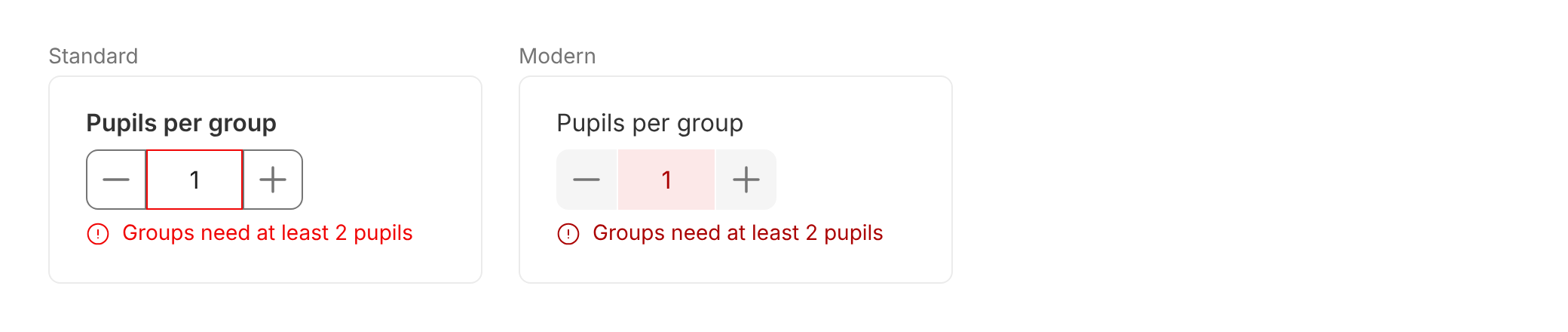
Errors appear when people leave the field, and again when they submit the form. An error clears as soon as the value is fixed. This is how Form behaves by default (validationMode="onBlur").
In the error state:
- Standard: the field border turns
danger, and the error message below the field isdanger. - Modern: the field background turns
dangerLightand its textdangerDark. The error message isdangerDark.
Write error messages that say what's wrong and how to fix it, such as "Enter the pupil's UPN" or "Enter an email address in the correct format, like [email protected]". Don't write "Invalid input" or "Error".
Disabled
People can't change a disabled field, and its value isn't sent with the form. If the reason isn't obvious, explain it in the description.

Accessibility
- Always give the field a label. The placeholder is never the label. With
hideLabel, the label is still read by screen readers. - Never rely on colour alone. Errors always come with a text message below the field.
- Mark required fields in text. Add "Fields marked * are required" above the form: the asterisk isn't read by screen readers.
- Explain disabled fields in the
descriptionwhen the reason isn't obvious. - Name the buttons. They're announced as "increment" and "decrement" by default. Always set
stepperButtonLabelsto something specific, such as "Add a pupil" and "Remove a pupil".
Do's and Don'ts
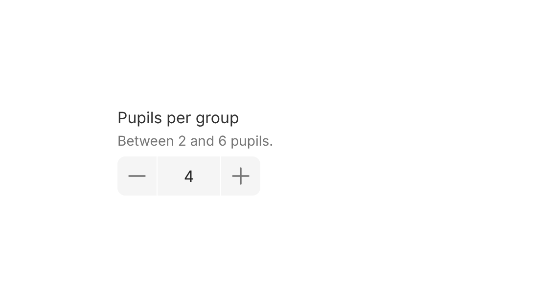
Do
Use it for small ranges, and say the range in the description.
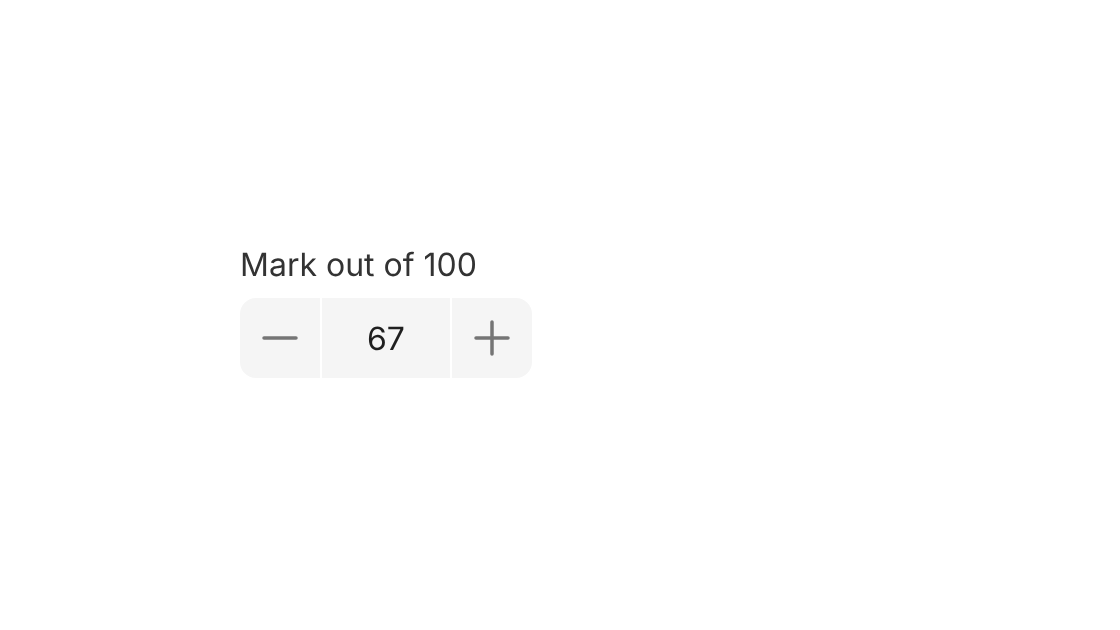
Don't
Use it for large ranges, such as marks out of 100. Use Input Field with type="number" instead.
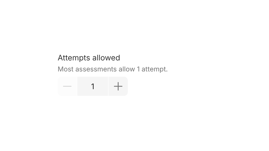
Do
Start from the most common value, so most people don't need to change it.
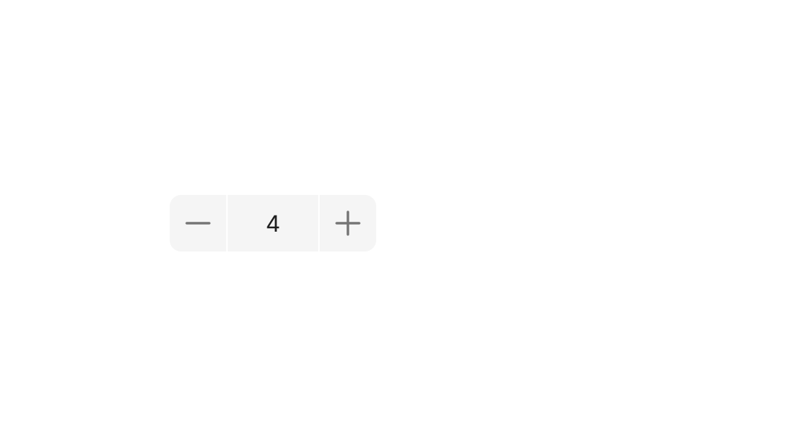
Don't
Leave it without a label. The number means nothing on its own.
Options
| Option | In code | Values | Default |
|---|---|---|---|
| Appearance | appearance | standard, modern | standard |
| Theme (modern only) | theme | grey, white | grey |
| Emphasis | emphasis | bold | None |
| Size | size | sm, md, lg | md |
| Default value | defaultValue | Number | 0 |
| Range | min, max | Numbers | 0, no maximum |
| Step | step | Number | 1 |
| Button labels | stepperButtonLabels | { increment, decrement } | "increment", "decrement" |
| Disabled button tooltip | disabledTooltipContent | { increment, decrement } | "Cannot enter values above/below" the limit |
| Label | label | Text | Required |
| Hide label | hideLabel | true, false | false |
| Description | description | Text | None |
| Prompt | prompt | { label, link } or { label, onClick } | None |
| Validation | validation | required, pattern, min, max and other rules, each with a message | None |
| Disabled | disabled | true, false | false |