
Overview
Use Create Password Field when people set a new password, such as when a teacher activates their account or resets a forgotten password. It shows the password rules and ticks them off as people type.
Anatomy
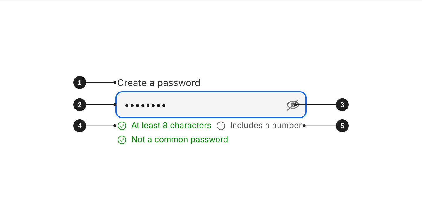
| # | Part | Description |
|---|---|---|
| 1 | Label | Defaults to "Create a password". |
| 2 | Field | Hides the characters people type. |
| 3 | Show/hide button | Shows or hides the password. |
| 4 | Rule met | Turns green with a tick as soon as the password meets it. |
| 5 | Rule not met | Neutral while people type. Turns red once they leave the field. |
When to use
- Activating an account and setting a password for the first time.
- Resetting a forgotten password.
- Changing a password from account settings.
When not to use
- Signing in with an existing password: use Password Field.
Rules
- Write each rule as a short phrase, such as "At least 8 characters". Don't write sentences.
- Show every rule the password must meet, and use the same rules as the server, so a password that passes here is never rejected after submit.
- List three or four rules at most.
- Keep the rules visible: don't move them into a tooltip or the description.
Appearance and theme
Create Password Field follows the same rules as the other fields. Use the modern appearance (appearance="modern") on new screens. Use the standard appearance only when the background doesn't give the field enough contrast and it needs a border.
With the modern appearance, use theme="grey" on white surfaces and theme="white" on grey surfaces.

Size
md(default, 40px): use it in forms, such as account settings.lg(48px): use it on sign-in, account activation and password reset screens.sm(32px): don't use it. A password field is never part of a dense table or filter bar.

Label and help text
- Keep the default label, "Create a password", or use "New password" when people are changing an existing one.
- Don't add a placeholder.
- Don't repeat the rules in the
description.
Validation and errors
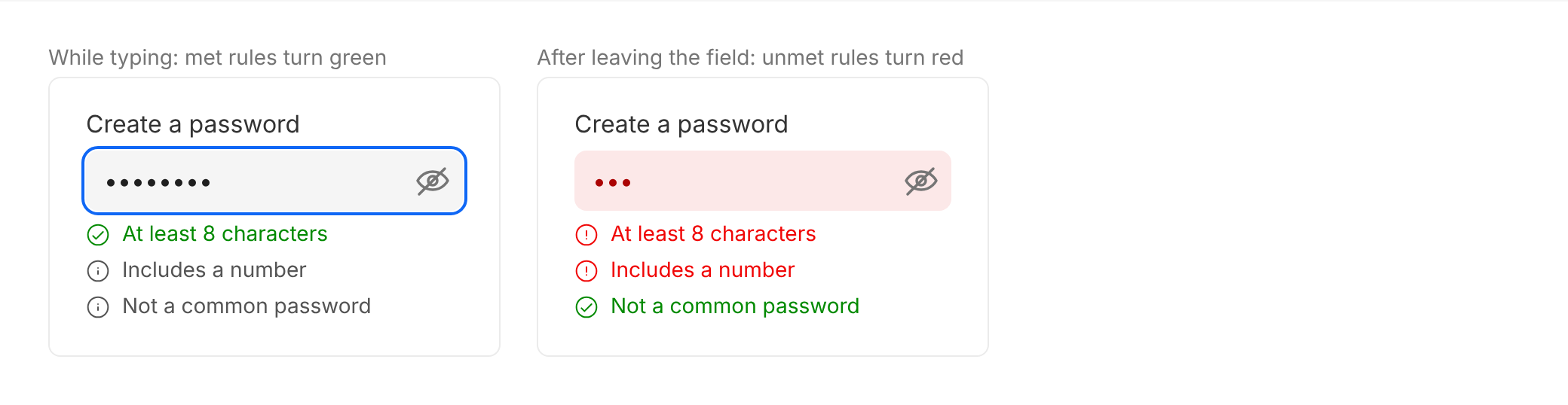
The rules are the error messages. Met rules turn green as people type. When people leave the field, unmet rules turn red, and the field shows its error state. The form can't be submitted until every rule is met.
Accessibility
- Always give the field a label. The placeholder is never the label. With
hideLabel, the label is still read by screen readers. - Never rely on colour alone. Errors always come with a text message below the field.
- Explain disabled fields in the
descriptionwhen the reason isn't obvious. - Rules don't rely on colour. Each rule has a different icon when it's met, not yet met and failed.
- Keep the show/hide button. It helps people check what they've typed.
Do's and Don'ts
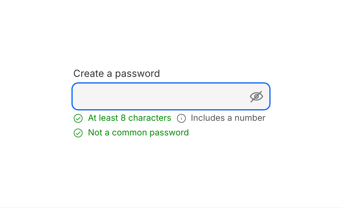
Do
Show each rule as a short phrase that ticks off as people type.
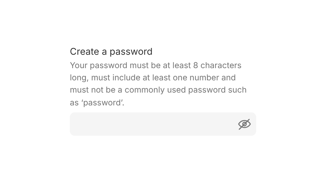
Don't
Explain the rules in a long description that people have to check themselves.
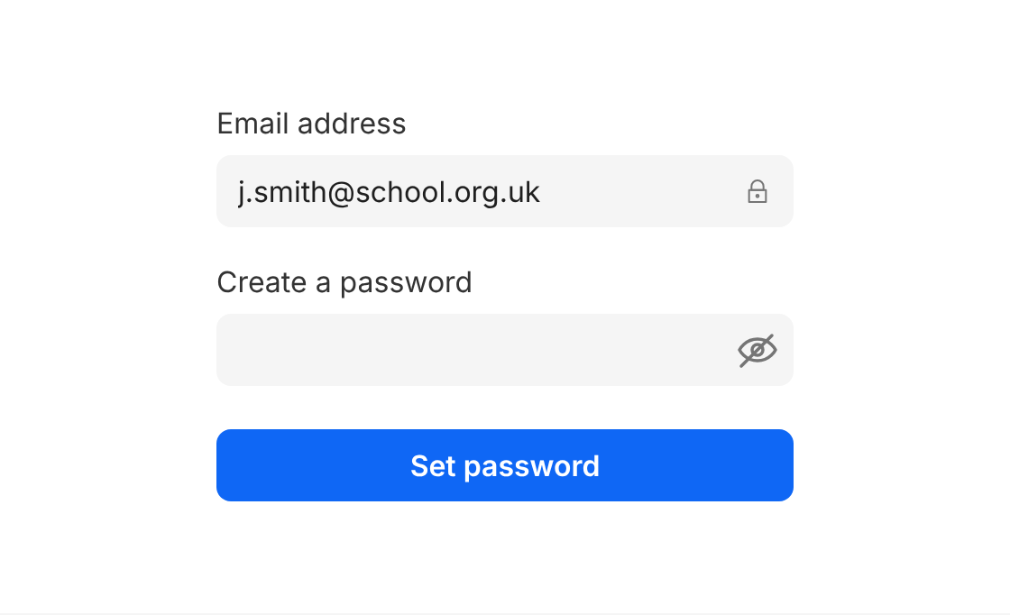
Do
Use it when people set a password, such as activating their account.
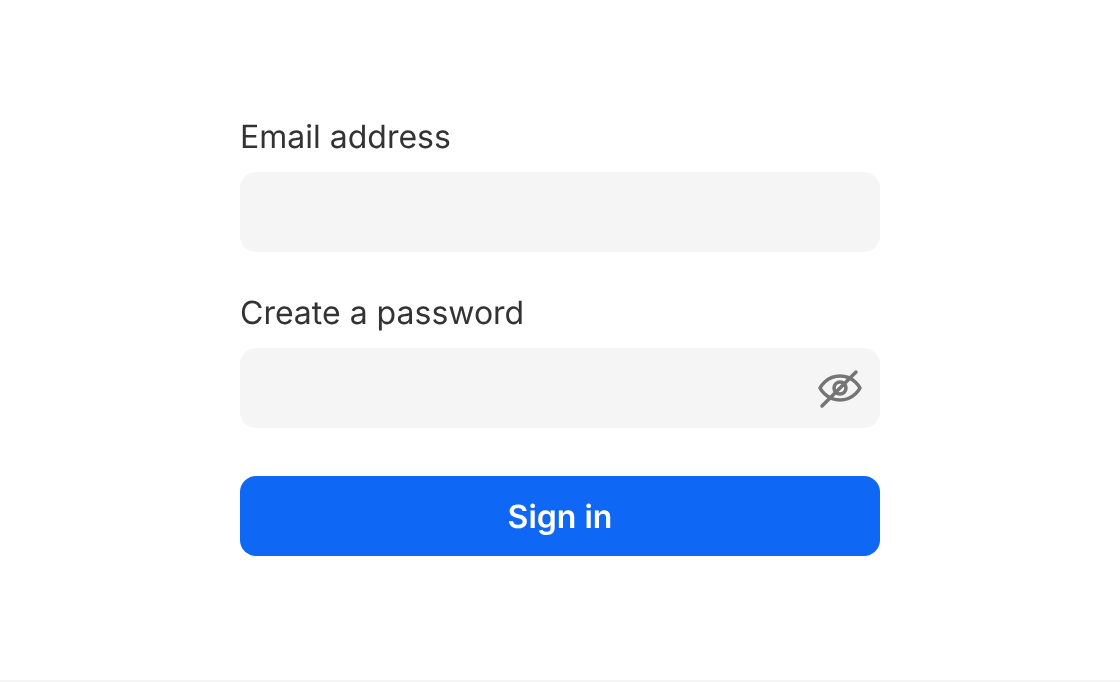
Don't
Use it on the sign-in screen. Use Password Field instead.
Options
| Option | In code | Values | Default |
|---|---|---|---|
| Appearance | appearance | standard, modern | standard |
| Theme (modern only) | theme | grey, white | grey |
| Size | size | sm, md, lg | md |
| Label | label | Text | "Create a password" |
| Name | name | Text | password |
| Rules | validate | Function returning { [rule]: true or false }, can be async | Required |
| First render | defaultValidation | { [rule]: true or false } | Required |
| Rule layout | messageDirection | row, column | row |
| Disabled | disabled | true, false | false |