
Overview
Use a chip toggle group to let people filter a collection by one or more categories, such as year group, topic or pupil group. Each chip switches between selected and unselected. A selected chip shows a tick.
Anatomy
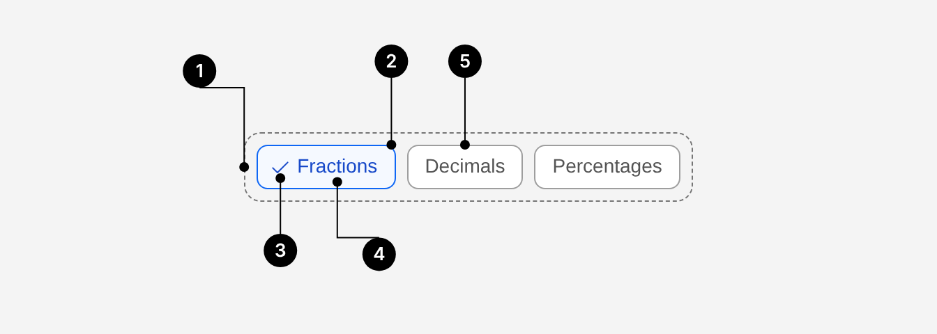
| # | Part | Description |
|---|---|---|
| 1 | Group | ChipToggleGroup. Lays chips out in a row that wraps, with an 8px gap. Each chip is a tab stop. |
| 2 | Chip (selected) | ChipToggleGroup.Item. The clickable container. 8px corner radius. |
| 3 | Tick | Shown only when the chip is selected, so selection never relies on colour alone. |
| 4 | Label | The chip's children. One to three words, in sentence case. Cut off with an ellipsis if too long. |
| 5 | Chip (unselected) | Same container without the tick. |
When to use
- Filtering a list, table or dashboard by categories, such as a question bank by year group or results by pupil group.
- Letting people pick any number of options (
type="multiple") or exactly one (type="single") from a short, visible set.
When not to use
- Showing status, such as Marked or Overdue. Use Badge.
- A single option, such as Show archived. Use Switch or Checkbox.
- A long list of options that won't fit in two rows. Use a select or Checkbox Group instead.
Do's and Don'ts
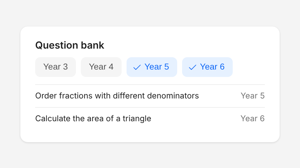
Do
Use chips to filter a collection, such as a question bank by year group.
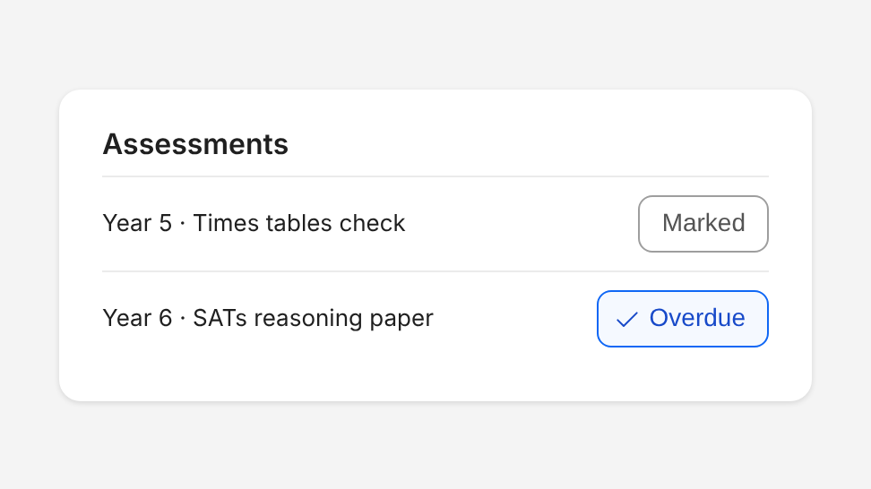
Don't
Use chips to show status. Use Badge instead.
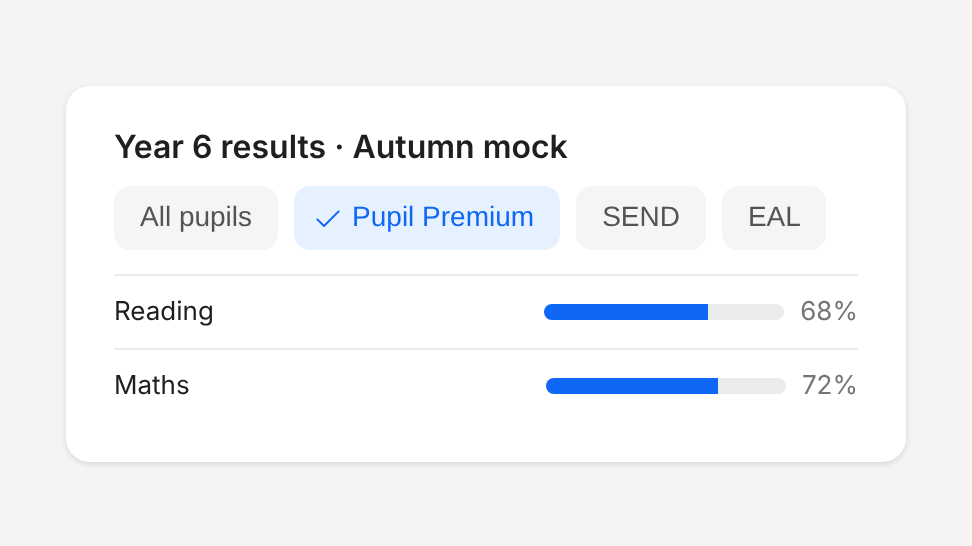
Do
Use chips to filter results by pupil group, such as Pupil Premium or SEND.
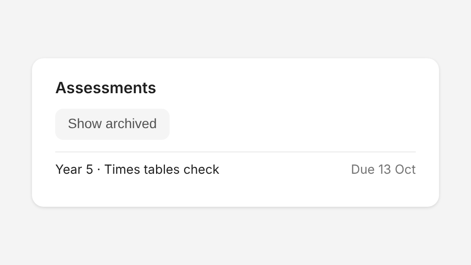
Don't
Show a group with only one chip. Use Switch or Checkbox instead.
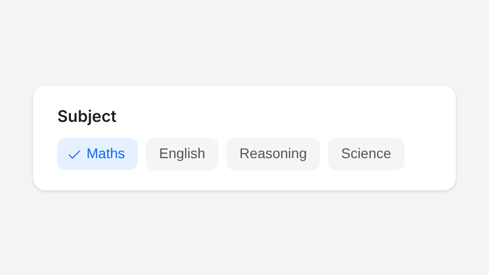
Do
Use one appearance and one size for every chip in a group.
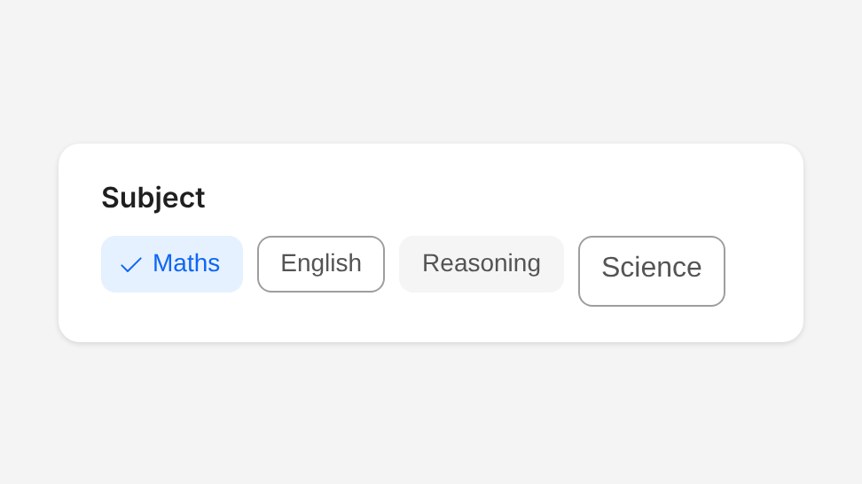
Don't
Mix standard and modern chips, or different sizes, in one group.
Choosing an appearance
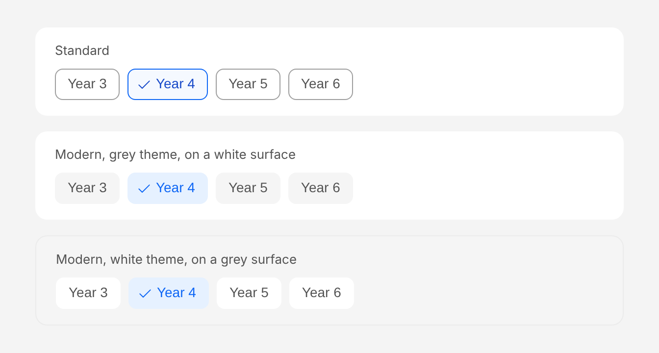
- Modern: use it for all new work. Chips have no border. Selected chips use a light primary background with primary text.
- Standard (default in code): outlined chips. Keep it on existing screens until they move to modern.
Modern has two themes. Choose the one that contrasts with the surface behind the chips:
theme="grey"(default): grey chips, for white surfaces such as cards and pages.theme="white": white chips, for grey surfaces such as filter panels and grey page backgrounds.
theme only affects the modern appearance.
States
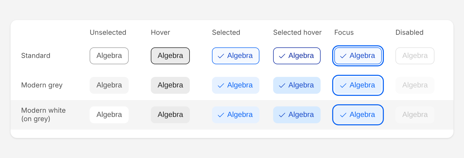
Chips have unselected, hover, selected, selected hover, focus and disabled states. When a chip has keyboard focus it gets the standard focus outline: 2px primary-800, 2px away from the chip, the same as other Atom components. Disabled chips are shown at 30% opacity and can't be selected. Disable a chip only when the reason is clear from the page; otherwise hide it.
Size
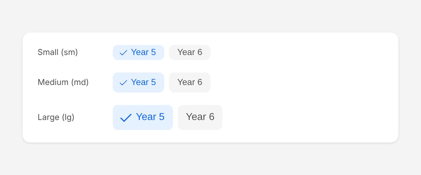
- Medium (
md, default): use it in most places, such as filter bars above lists and dashboards. - Small (
sm): use it in dense areas, such as inside a table toolbar or a narrow side panel. - Large (
lg): use it when chips are the main control on the page, or next to large headings.
Use the same size for every chip in a group.
Selection
type="multiple": any number of chips can be selected. Use it for filters, where no selection means "show everything".type="single": one chip at a time. AdddisableDeselectwhen there must always be a selection, and include an "All" chip as the first option.
Wrapping and long labels
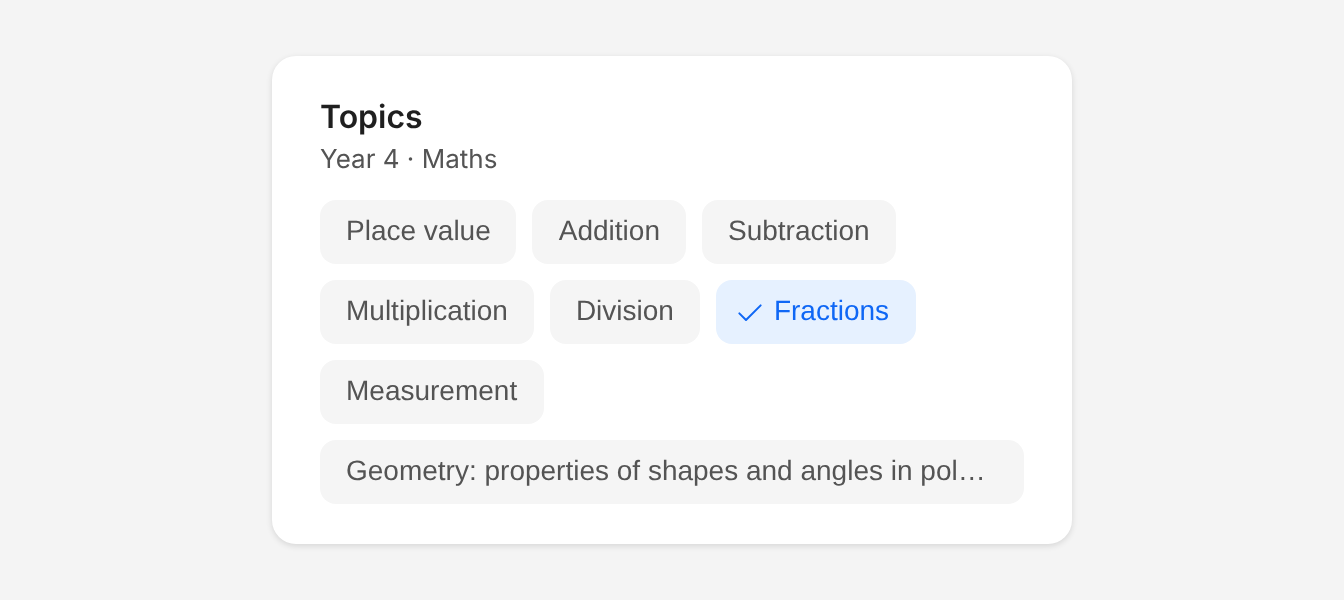
Chips wrap onto a new row when they run out of space. Labels never wrap inside a chip: a label wider than the group is cut off with an ellipsis. Keep labels to one to three words so this rarely happens.
Accessibility
- Name the group. Give
ChipToggleGroupanaria-label(for example "Filter by year group"), or pointaria-labelledbyat the visible heading above it. - Keyboard. Tab moves from chip to chip, skipping disabled chips, and Shift+Tab moves back. The focused chip shows the standard blue focus outline; Space or Enter selects or deselects it. With
type="multiple"the group is a toolbar of toggle buttons (pressed or not pressed). Withtype="single"it is a radio group (checked or not checked). - Never rely on colour alone. The tick marks selected chips. Don't remove it or replace it with colour.
- Keep labels meaningful on their own. "Year 5", not "5".
- Touch targets. Medium chips are 32px tall and small chips 24px. Keep the 8px gap between them and avoid placing them next to other small controls.
Structure and spacing
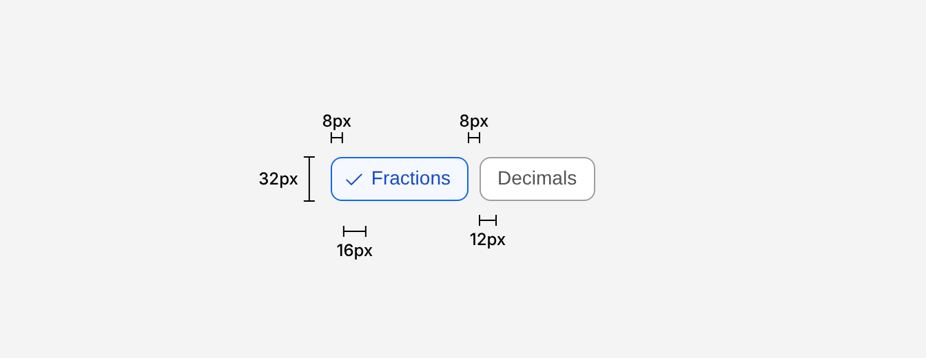
| Property | Token | px | rem |
|---|---|---|---|
| Height - sm | - | 24px | 1.5 |
| Height - md (default) | - | 32px | 2 |
| Height - lg | - | 40px | 2.5 |
| Border radius | radius-md | 8px | 0.5 |
| Border (standard only) | - | 1px | - |
| Padding x, chip edge | space-2 | 8px | 0.5 |
| Padding x, label | space-1 | 4px | 0.25 |
| Text inset without tick | - | 12px | 0.75 |
| Tick icon - sm & md | sm | 16px | 1 |
| Tick icon - lg | md | 24px | 1.5 |
| Gap between chips | space-2 | 8px | 0.5 |
| Focus outline | - | 2px, 2px offset | - |
Typography
| Chip size | Family | Weight | Text size | rem | px |
|---|---|---|---|---|---|
| sm, md | body | 400 | sm | 0.875rem | 14 |
| lg | body | 400 | md | 1rem | 16 |
Colour
| Appearance | State | Background | Border | Text |
|---|---|---|---|---|
| Standard | Unselected | white | grey-600 | grey-800 |
| Standard | Hover | grey-200 | grey-1000 | grey-1000 |
| Standard | Selected | primary-100 | primary-800 | primary-900 |
| Modern grey | Unselected | grey-100 | none | grey-800 |
| Modern white | Unselected | white | none | grey-800 |
| Modern | Hover | grey-200 | none | grey-1000 |
| Modern | Selected | primary-200 | none | primary-800 |
| Modern | Selected hover | primary-300 | none | primary-900 |
| All | Focus | Unchanged | + primary-800 outline | Unchanged |
Options
| Option | In code | Values | Default |
|---|---|---|---|
| Selection | type | multiple, single | Required |
| Appearance | appearance | standard, modern | standard |
| Theme | theme | grey, white (modern only) | grey |
| Size | size | sm, md, lg | md |
| Keep one selected | disableDeselect | true, false | false |
| Disabled | disabled | On the group or on a single chip | false |