
Overview
Use a chip dismissible group to show values people have added or applied, such as active filters or the classes an assessment is set for, and let them remove each one with its dismiss button.
Anatomy
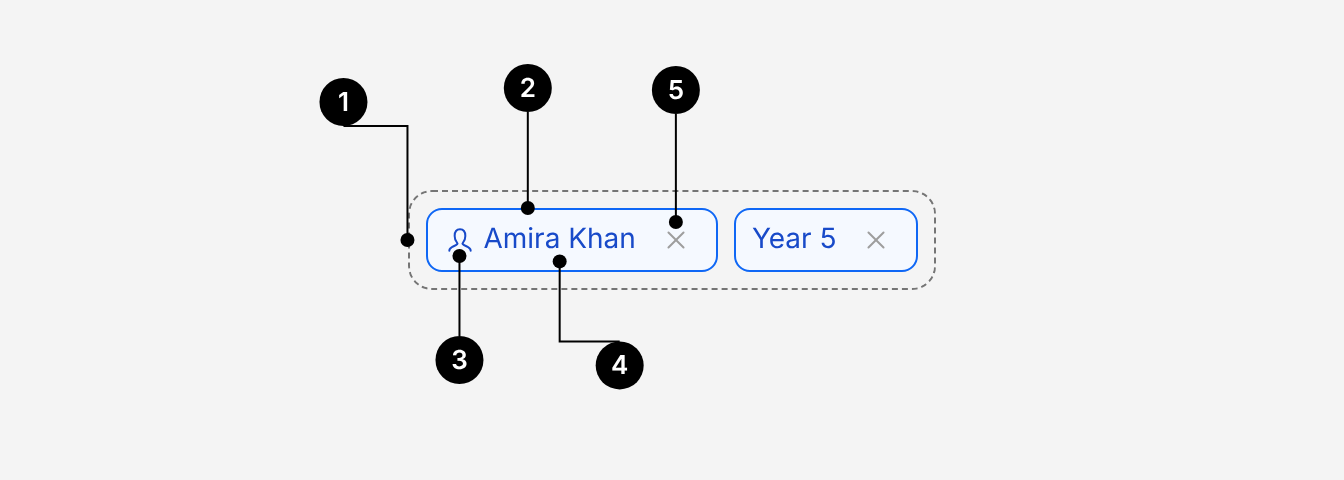
| # | Part | Description |
|---|---|---|
| 1 | Group | ChipDismissibleGroup. Lays chips out in a row that wraps, with an 8px gap. Calls onDismiss with the chip's value. |
| 2 | Container | ChipDismissibleGroup.Item. 8px corner radius. Not clickable itself. |
| 3 | Leading icon (optional) | An Icon child, such as a person for a pupil. Reinforces the label, never replaces it. |
| 4 | Label | One to three words, in sentence case. Cut off with an ellipsis if too long. |
| 5 | Dismiss button | Removes the chip. Its accessible name comes from dismissActionLabel. |
When to use
- Showing filters applied to a list, table or dashboard, so people can see and remove them, such as Year 6 and Pupil Premium on a results page.
- Showing values chosen in a field, such as the classes and pupils an assessment is set for.
When not to use
- Options people choose from. Use Chip Toggle Group.
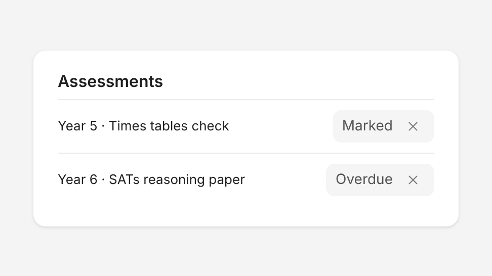
- Showing status, such as Marked or Overdue. Use Badge.
Do's and Don'ts
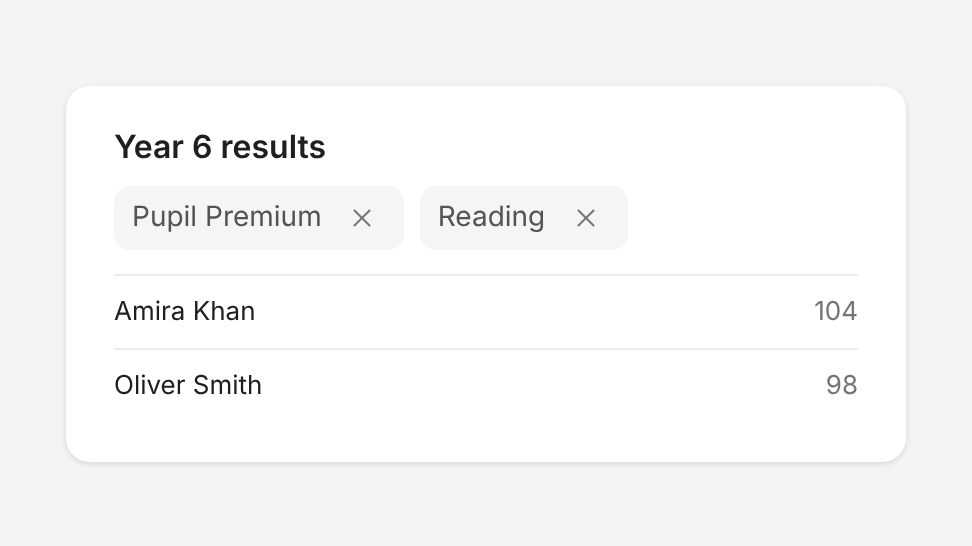
Do
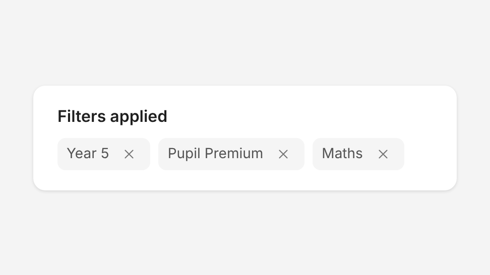
Show applied filters as dismissible chips above the results they filter.
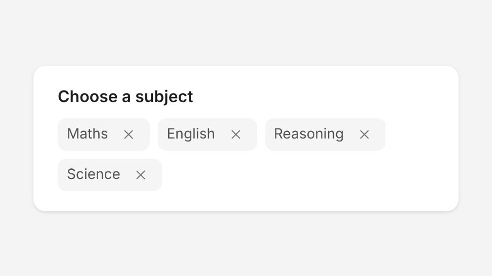
Don't
Use dismissible chips for options people choose from. Use Chip Toggle Group instead.
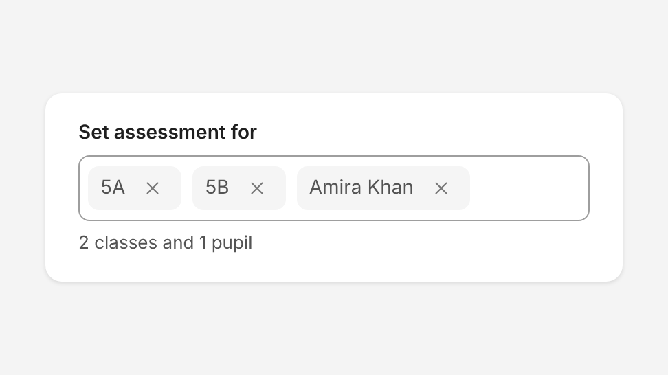
Do
Show the values chosen in a field, such as the classes and pupils an assessment is set for.
Don't
Use dismissible chips to show status. Use Badge instead.
Do
Use one appearance and one size for every chip in a group.
Don't
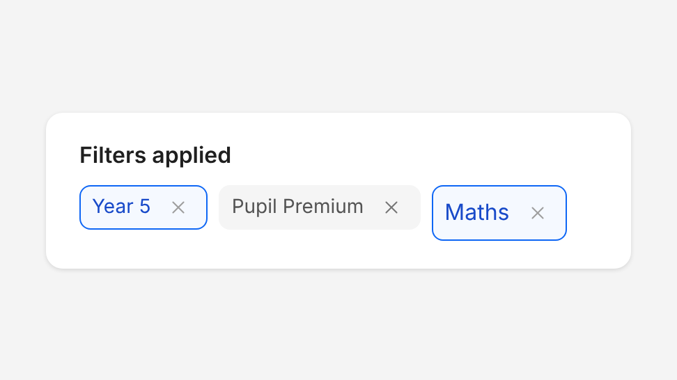
Mix standard and modern chips, or different sizes, in one group.
Choosing an appearance
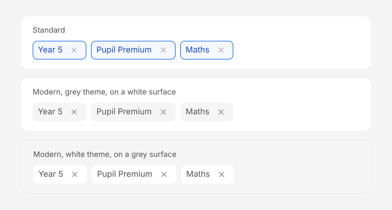
- Modern: use it for all new work. Chips have no border and use neutral grey text.
- Standard (default in code): outlined chips in primary colours. Keep it on existing screens until they move to modern.
Modern has two themes. Choose the one that contrasts with the surface behind the chips:
theme="grey"(default): grey chips, for white surfaces such as cards, pages and input fields.theme="white": white chips, for grey surfaces such as filter panels and grey page backgrounds.
theme only affects the modern appearance. Use the same appearance as any Chip Toggle Group on the same screen.
States
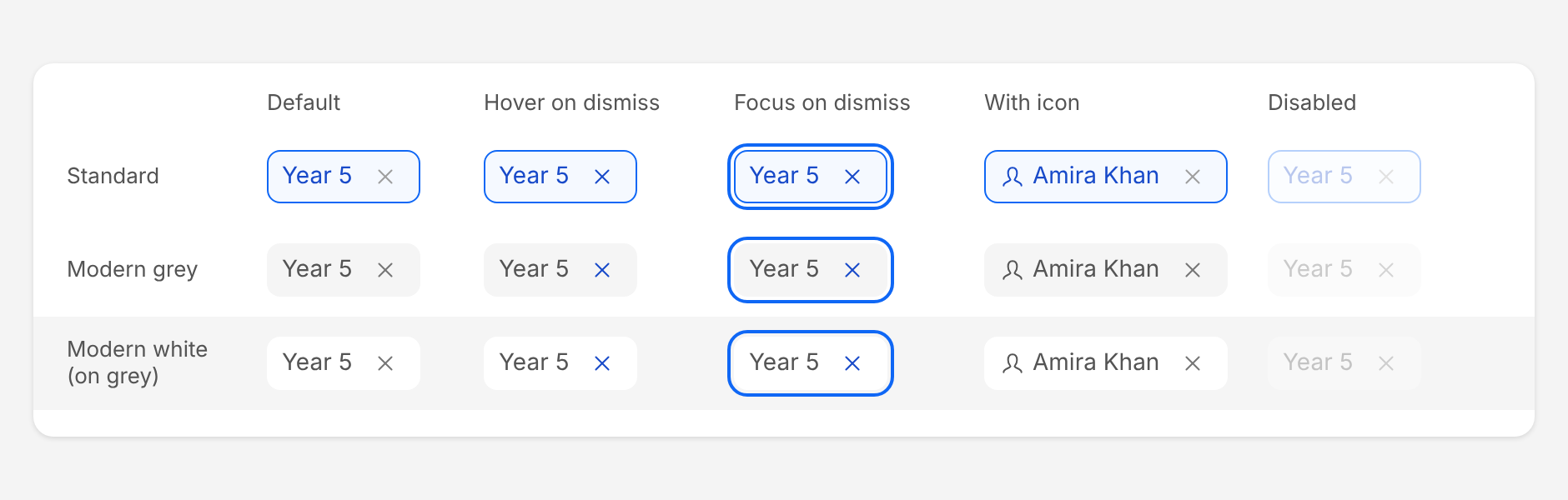
The dismiss button turns primary on hover and focus. When the dismiss button has keyboard focus, the whole chip gets the standard focus outline: 2px primary-800, 2px away from the chip, the same as other Atom components. Disabled chips are shown at 30% opacity and can't be removed. Set disabled on one chip, or on the group to lock them all.
Size
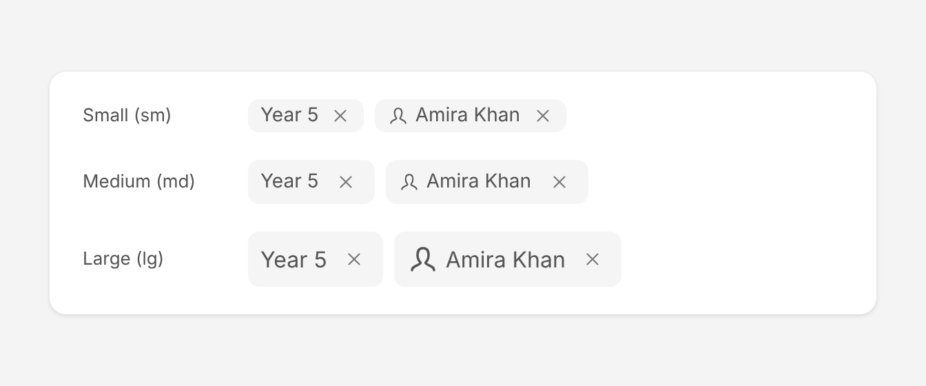
- Medium (
md, default): use it in most places. - Small (
sm): use it inside input fields and in dense areas. Its dismiss button is 24px. - Large (
lg): use it when chips are the main content of the area.
Use the same size for every chip in a group, and match the size of a Chip Toggle Group on the same screen.
Wrapping and long labels
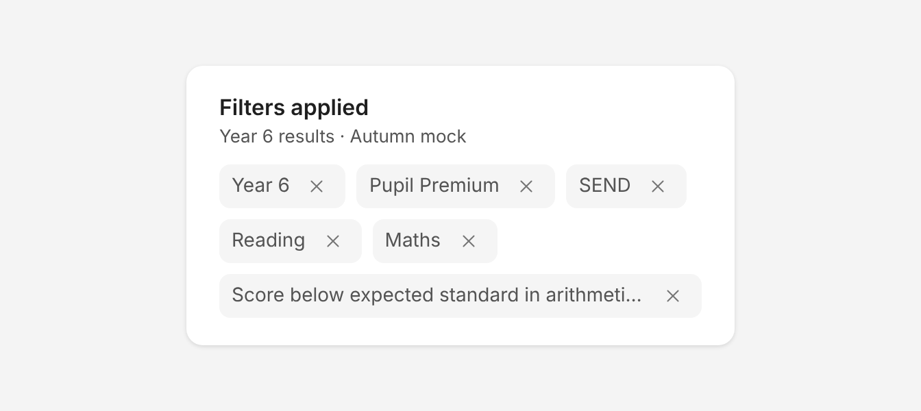
Chips wrap onto a new row when they run out of space. A label wider than the group is cut off with an ellipsis; the dismiss button always stays visible.
Accessibility
- Label every dismiss button. Set
dismissActionLabelto say what is removed, such as "Remove Year 5". The default, "Dismiss", doesn't say which chip it belongs to. - Move focus after removing a chip. The chip disappears when dismissed, and focus isn't moved for you. In
onDismiss, move focus to the next chip's dismiss button, or to the field or heading the chips belong to when none are left. - Name the group. Give
ChipDismissibleGroupanaria-label(for example "Filters applied"), or put a visible heading right above it. - Keyboard. Tab moves from one dismiss button to the next, skipping disabled chips, and Shift+Tab moves back. Enter or Space removes the chip. The focused chip shows the standard blue focus outline.
- Never rely on the icon alone. A leading icon reinforces the label; the label must make sense without it.
- Touch targets. The dismiss button is 32px on medium and large chips and 24px on small chips. Keep the 8px gap between chips.
Structure and spacing
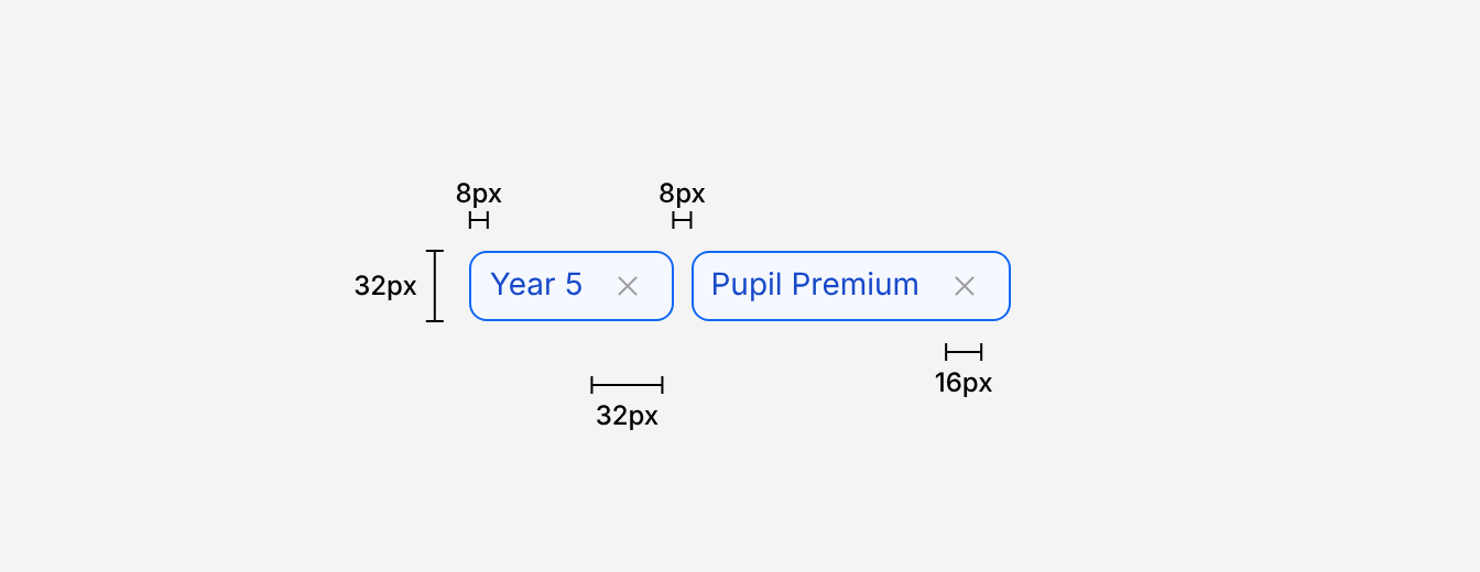
| Property | Token | px | rem |
|---|---|---|---|
| Height - sm | - | 24px | 1.5 |
| Height - md (default) | - | 32px | 2 |
| Height - lg | - | 40px | 2.5 |
| Border radius | radius-md | 8px | 0.5 |
| Border (standard only) | - | 1px | - |
| Padding x, chip edge | space-1 | 4px | 0.25 |
| Padding x, label | space-1 | 4px | 0.25 |
| Dismiss button - sm | - | 24px | 1.5 |
| Dismiss button - md & lg | - | 32px | 2 |
| Dismiss icon | sm | 16px | 1 |
| Gap between chips | space-2 | 8px | 0.5 |
| Focus outline | - | 2px, 2px offset | - |
Typography
| Chip size | Family | Weight | Text size | rem | px |
|---|---|---|---|---|---|
| sm, md | body | 400 | sm | 0.875rem | 14 |
| lg | body | 400 | md | 1rem | 16 |
Colour
| Appearance | Background | Border | Text | Dismiss icon (hover) |
|---|---|---|---|---|
| Standard | primary-100 | primary-800 | primary-900 | grey-600 (primary-900) |
| Modern grey | grey-100 | none | grey-800 | grey-700 (primary-900) |
| Modern white | white | none | grey-800 | grey-700 (primary-900) |
On keyboard focus, every appearance adds a primary-800 focus outline around the chip.
Options
| Option | In code | Values | Default |
|---|---|---|---|
| Appearance | appearance | standard, modern | standard |
| Theme | theme | grey, white (modern only) | grey |
| Size | size | sm, md, lg | md |
| Dismiss label | dismissActionLabel | Text, such as "Remove Year 5" | "Dismiss" |
| Disabled | disabled | On the group or on a single chip | false |
| Leading icon | Icon child | Any icon, before the label | None |