
Overview
Use a checkbox to let people select any number of items from a set, including none, such as pupils in a class, topics for a practice or rows in a results table.
Checkbox is the box on its own, with no label. In forms, use Checkbox Field, which adds a visible label and shows errors.
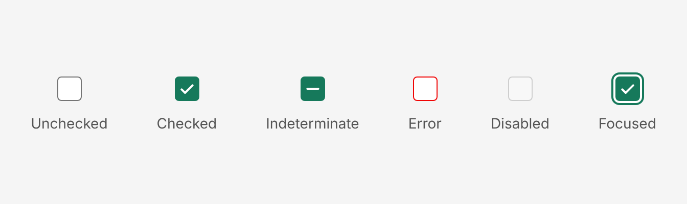
Anatomy
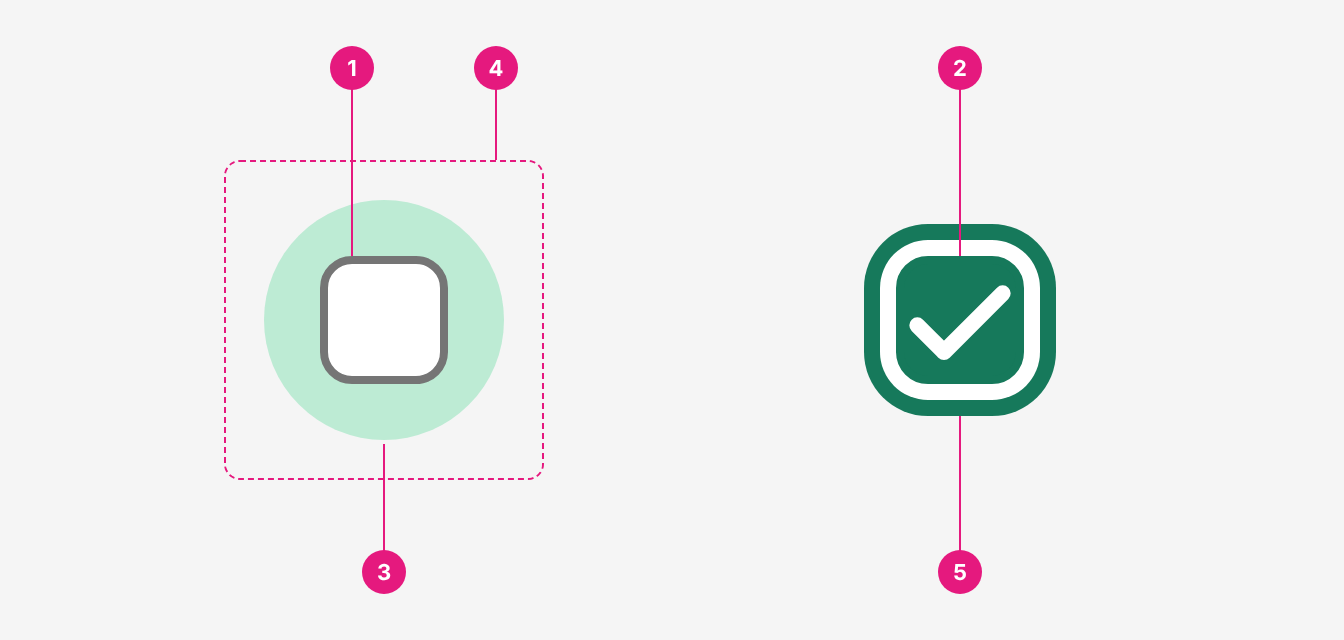
| # | Part | Description |
|---|---|---|
| 1 | Box | 16px (md) or 24px (lg). White, 1px grey-700 border, 4px corner radius. Fills primary-800 when checked. |
| 2 | Indicator | A tick when checked, a dash when indeterminate. White. |
| 3 | Hover halo | A primary-300 circle behind the box on hover. 32px (md) or 40px (lg). |
| 4 | Click area | Invisible, larger than the box: 40px (md) or 48px (lg). |
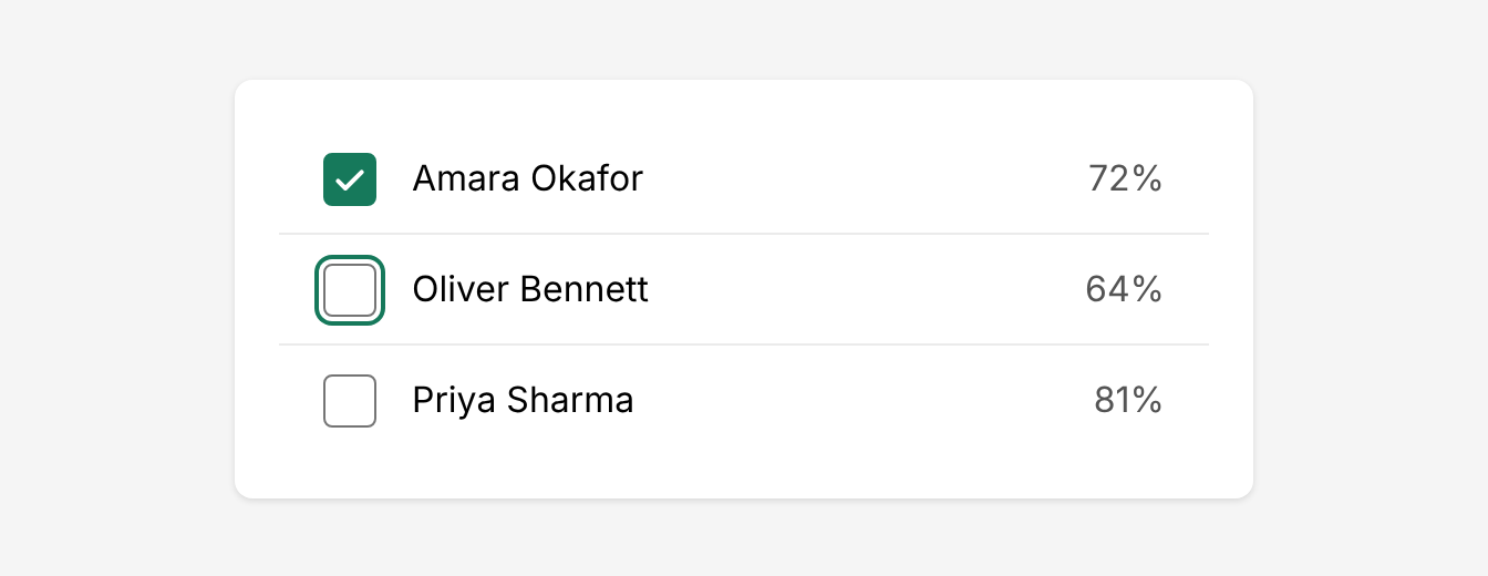
| 5 | Focus ring | A 2px white gap and a 2px primary-800 ring. Shows only when focused with the keyboard. |
Use it when
- People can select any number of items from a set, including none.
- Each item sits in a row whose text names it, such as a table row, a list item or a tree node. For example, selecting pupils in a results table, choosing topics when creating a practice, or choosing classes and pupils when setting an assessment.
- Filtering by several values at once, such as year groups in a trust dashboard filter.
Don't use it when
- The checkbox needs its own label, as in a form. Use Checkbox Field.
- People can pick only one option, such as one year group or one mark scheme. Use Radio Button.
- The choice takes effect straight away, such as "Show answers to pupils". Use Switch.
- Selecting it would run a command or open another window. A checkbox only records a choice; use a Button.
Size
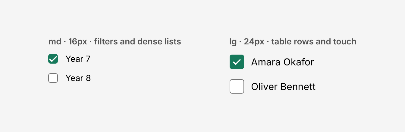
md(default, 16px): dense desktop interfaces, such as filter dropdowns and settings lists.lg(24px): pupil-facing screens, touch screens and table rows. Onlylgmeets the 44px minimum touch target.
Use the same size for every checkbox in a group.
Indeterminate
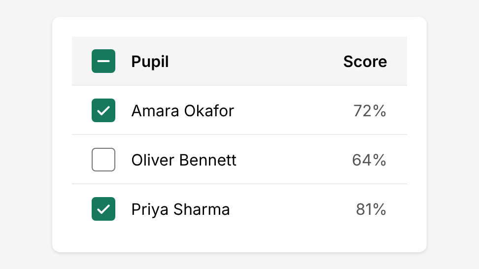
Use checked="indeterminate" only on a "select all" checkbox or a parent row, when some but not all of its items are selected. Clicking it selects everything.
Never use indeterminate to mean "not sure" or "partly". It isn't an answer.
Try it: select some pupils, then use the select all checkbox.
const PupilSelection = () => {
  const pupils = ['Amara Okafor', 'Oliver Bennett', 'Priya Sharma']
  const [selected, setSelected] = React.useState(['Oliver Bennett'])
  const all = selected.length === pupils.length
  const some = selected.length > 0 && !all

  return (
    <div className="flex flex-col gap-3">
      <label className="flex gap-3 items-center">
        <Checkbox
          size="lg"
          checked={some ? 'indeterminate' : all}
          onCheckedChange={() => setSelected(all ? [] : pupils)}
        />
        <Text weight="bold">Select all pupils in 7A</Text>
      </label>
      {pupils.map((pupil) => (
        <label key={pupil} className="flex gap-3 items-center">
          <Checkbox
            size="lg"
            checked={selected.includes(pupil)}
            onCheckedChange={(value) =>
              setSelected(value ? [...selected, pupil] : selected.filter((p) => p !== pupil))
            }
          />
          <Text>{pupil}</Text>
        </label>
      ))}
    </div>
  )
}
render(<PupilSelection />)
Error
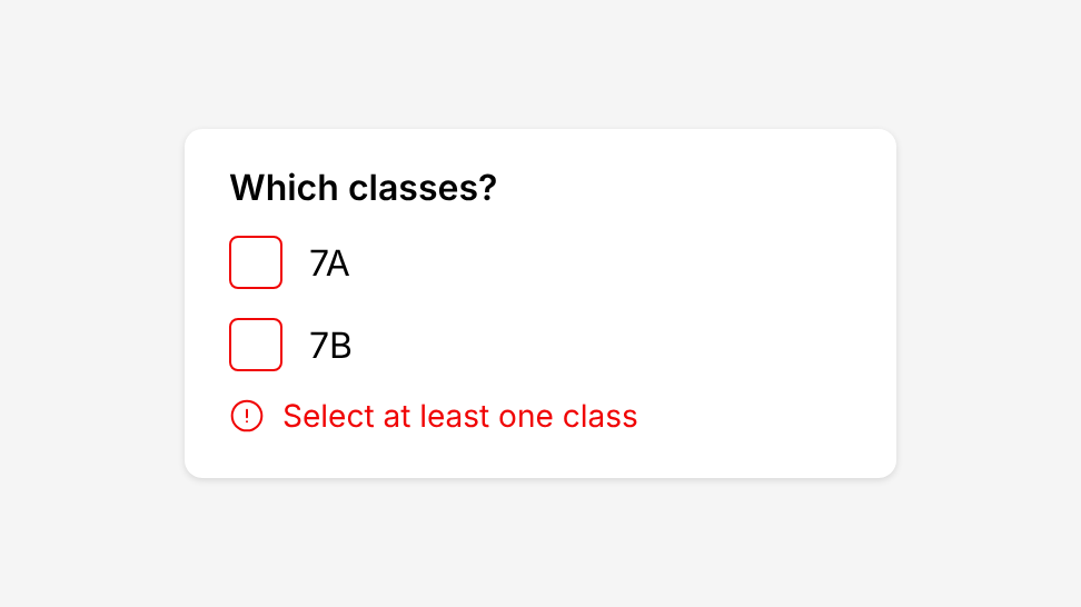
state="error" turns the border red. Always show an error message in text next to it; the red border alone isn't enough. Checkbox Field does this for you.
Keyboard
Tab moves focus to the checkbox and Space ticks or unticks it. Enter does nothing, as for any checkbox. The focus ring shows only when focus comes from the keyboard.
Accessibility
- Give it a name. A bare checkbox has no visible label, so give it an
aria-labelthat names the item, such as "Select Amara Okafor", or wrap it in a<label>with the row text. - Errors need text. Show an error message next to the checkbox, not only the red border.
- Never rely on colour alone. Checked and indeterminate states use a tick or a dash as well as colour.
- Use
lgfor touch. Onlylghas a click area of at least 44px.
Do's and Don'ts
Do
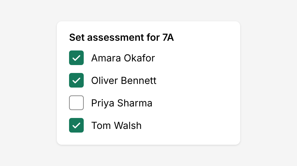
Let teachers select several items from a list, such as pupils to set an assessment for.
Don't
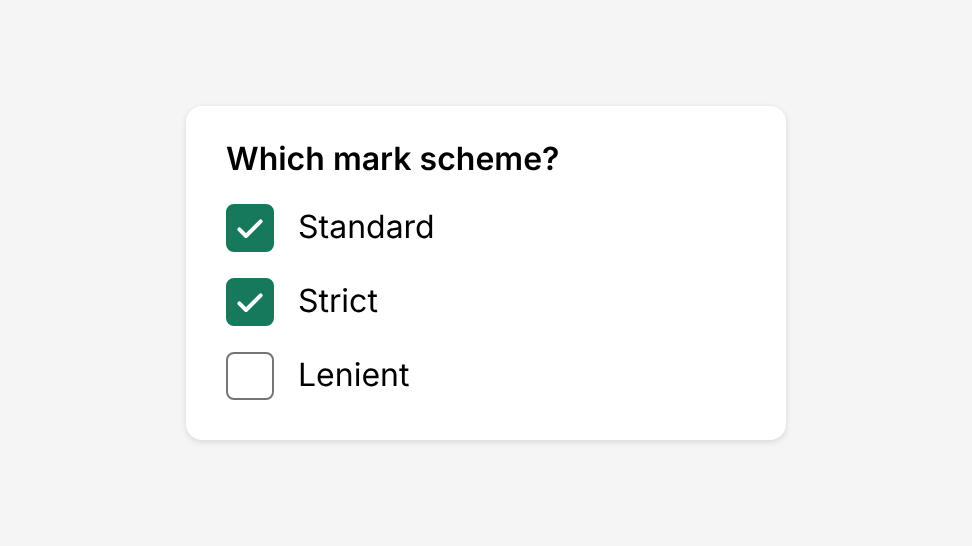
Use checkboxes when only one option can be picked, such as a mark scheme. Use Radio Button instead.
Do
Use a select all checkbox in a table header. It goes indeterminate when only some rows are selected.
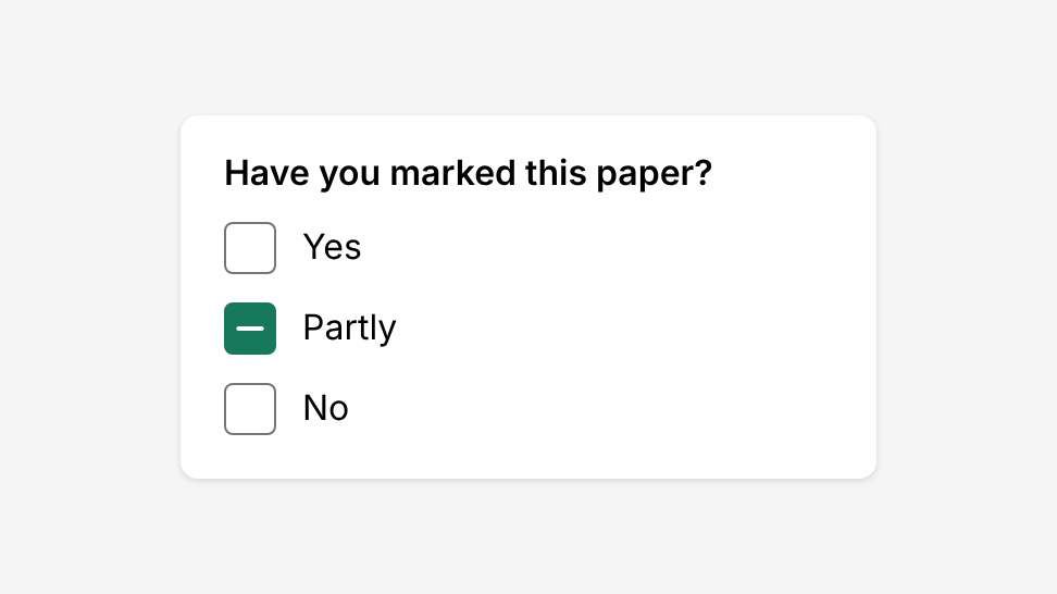
Don't
Use indeterminate to mean “not sure” or “partly”. It isn’t an answer.
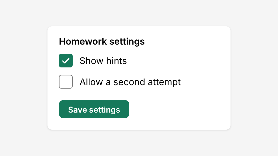
Do
Use checkboxes for choices that are saved together with a button.
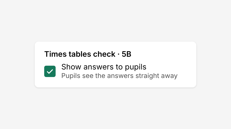
Don't
Use a checkbox for a setting that takes effect straight away. Use Switch instead.
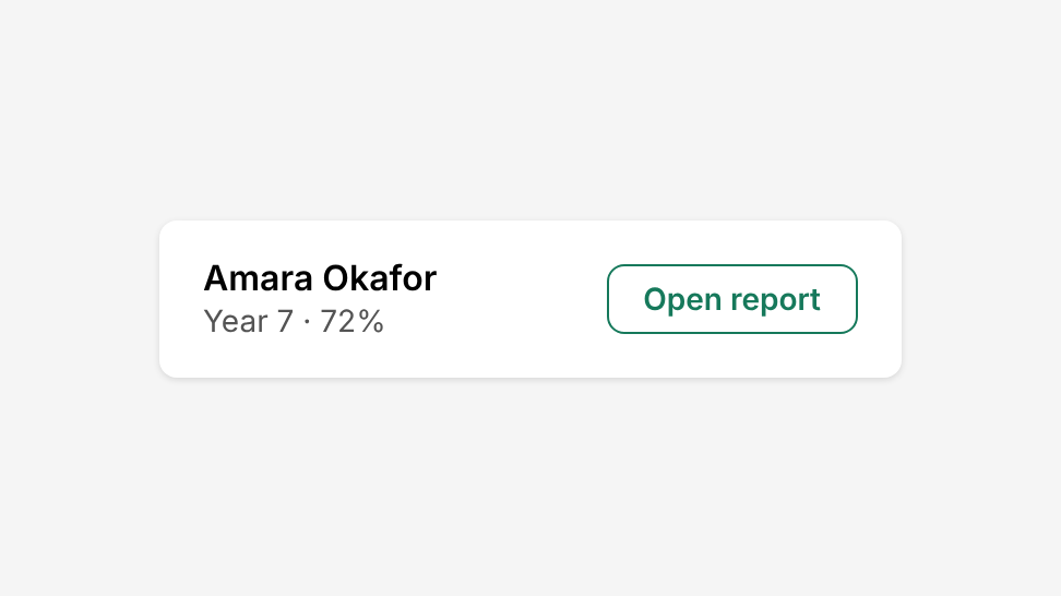
Do
Use a button to run a command or open another page.
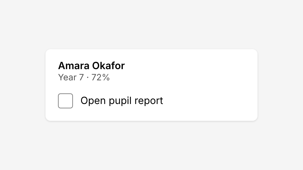
Don't
Use a checkbox to run a command or open another window.
Do
Show an error message in text next to the checkboxes.
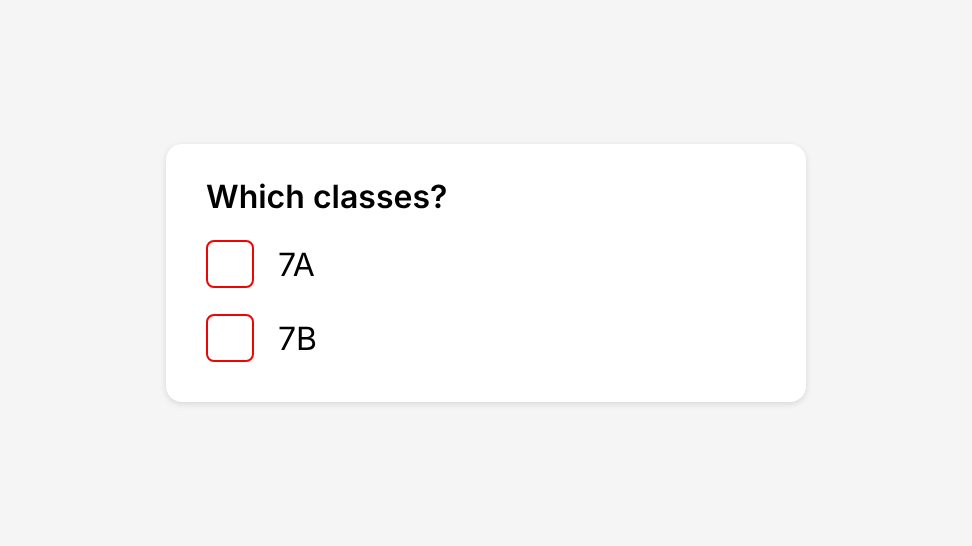
Don't
Rely on the red border alone to show an error.
Structure and spacing
| Property | Token | px | rem |
|---|---|---|---|
| Box - md | size-4 | 16px | 1 |
| Box - lg | size-6 | 24px | 1.5 |
| Border | - | 1px | - |
| Border radius | radius-sm | 4px | 0.25 |
| Hover halo - md | - | 32px | 2 |
| Hover halo - lg | - | 40px | 2.5 |
| Click area - md | - | 40px | 2.5 |
| Click area - lg | - | 48px | 3 |
| Focus ring gap | white | 2px | 0.125 |
| Focus ring | primary-800 | 2px | 0.125 |
Colour
| State | Border | Fill | Atom | Quest |
|---|---|---|---|---|
| Unchecked | grey-700 | white | #757575 | #757575 |
| Checked, indeterminate | primary-800 | primary-800 | #0F67F5 | #16795B |
| Hover halo | - | primary-300 | #D6EAFF | #BDEBD4 |
| Error | danger | white | #F00505 | #F00505 |
| Focus ring | primary-800 | - | #0F67F5 | #16795B |
| Disabled | 30% opacity | - | - | - |
Options
| Option | In code | Values | Default |
|---|---|---|---|
| Checked | checked, defaultChecked | true, false, "indeterminate" | Unchecked |
| Size | size | md, lg. Can change by breakpoint. | md |
| Error | state | error | None |
| Disabled | disabled | 30% opacity, not clickable | Enabled |
| Name | aria-label | Text for screen readers | None |