
Overview
Use Checkbox Group to keep a set of checkboxes in step, with an optional "select all", such as choosing pupils in a class when setting an assessment.
It handles the selection only. It shows no heading or labels of its own: you add those around its items.
Anatomy
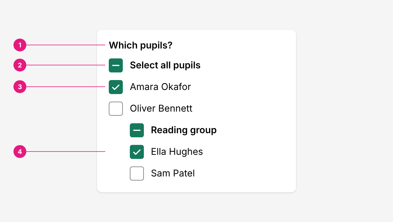
| # | Part | Description |
|---|---|---|
| 1 | Heading | Yours, not part of the component. Says what's being chosen, such as "Which pupils?". |
| 2 | Select all | CheckboxGroup.AllItem. Ticked when every item is selected, indeterminate when some are. Ticking it selects all; unticking clears all. |
| 3 | Item | CheckboxGroup.Item, with a value. A Checkbox: add its text next to it. |
| 4 | Sub group | CheckboxGroup.Sub. A nested set with its own select all. The top select all includes its items too. |
Use it when
- People select any number of items from a flat list, such as pupils in a class or classes in a year group.
- A list needs a select all, or a one-level split with its own select all, such as a reading group within a class.
Don't use it when
- Items sit in levels that need to open and close, such as subjects and their assessments, or year groups, classes and pupils. Use Checkbox Tree.
- There's a single yes or no choice in a form. Use Checkbox Field.
- People pick one option. Use Radio Button.
Heading and names
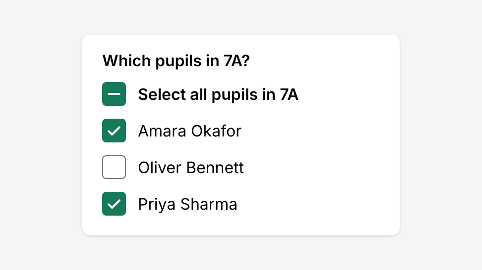
Every group has a visible heading that says what's being chosen, such as "Which pupils in 7A?".
Give every item, including select all, an aria-label that names it: "Amara Okafor", "Select all pupils in 7A". Without one, an item is named by its value (often an ID) and select all is named "all".
Select all
Put select all first, above the items, and say what it covers: "Select all pupils in 7A".
Select all only counts items that are on screen. If the list is filtered, it selects only the items still shown.
Items that don't fit
When an item doesn't belong where people expect, say why next to it, for example with a Badge such as "Out of year (Year 8)". Don't grey it out or hide it with no reason.
Size
Use size="lg" on items in table rows, lists and touch screens, so the click area is at least 44px. See Checkbox.
Keyboard
Each checkbox is a Tab stop. Space ticks or unticks the focused checkbox, including select all.
Accessibility
- Head every group. A visible heading tells everyone what the list is for.
- Name every checkbox. Use
aria-labelwith the item's text, or wrap the checkbox and its text in a<label>. - Say what select all covers. "Select all pupils in 7A", not "All".
- Explain what's different. Use text, such as a Badge, for items that stand out, never colour alone.
Do's and Don'ts
Do
Give the group a visible heading, and put select all first.
Don't
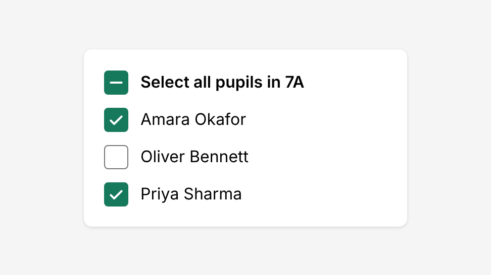
Show a list of checkboxes with no heading to say what it’s for.
Do
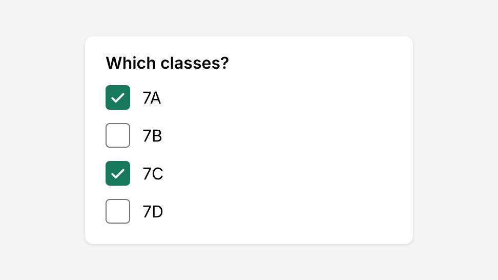
Use Checkbox Group for a flat list, such as classes.
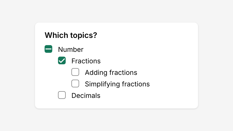
Don't
Nest three levels, such as topics and sub-topics, in a group. Use Checkbox Tree.
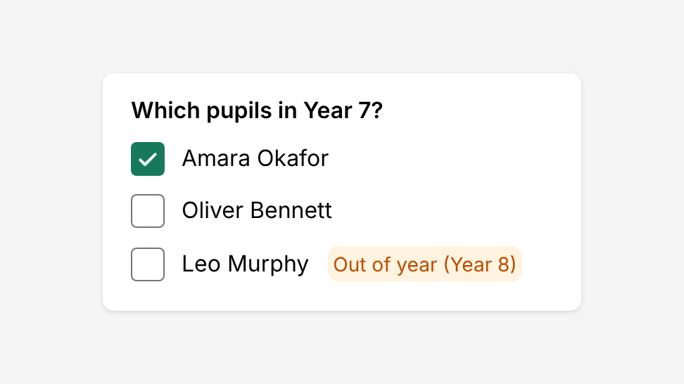
Do
Flag an item that doesn’t fit with a Badge, such as an out-of-year pupil.
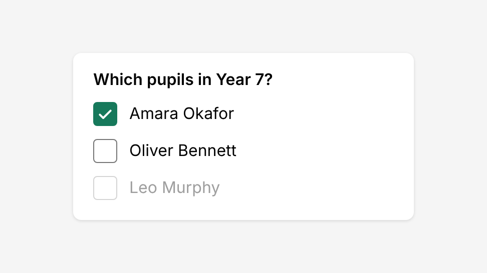
Don't
Grey out or hide an item with no explanation.
Options
| Option | In code | Values | Default |
|---|---|---|---|
| Selected items | checked, defaultChecked | A list of item values | None |
| On change | onCheckedChange | Called with the new list of values | None |
| Item | CheckboxGroup.Item | Takes a value and any Checkbox option, such as size | - |
| Select all | CheckboxGroup.AllItem | Any Checkbox option, such as size | - |
| Sub group | CheckboxGroup.Sub | Wraps a nested set of items | - |