Overview
Use a badge to show the status or a key attribute of something at a glance, such as whether an assessment has been marked, or the topic of a question.
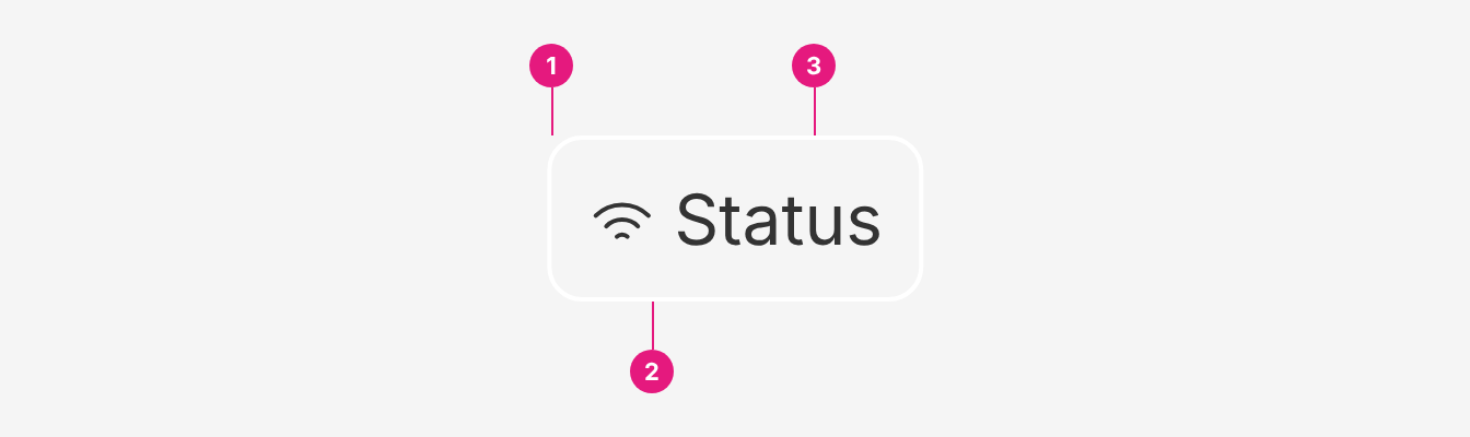
| # | Part | Description |
|---|---|---|
| 1 | Container | Carries the colour (theme) and strength (emphasis). 8px corner radius. |
| 2 | Icon (optional) | Badge.Icon, or an Icon child. Reinforces the label, never replaces it. |
| 3 | Label | Badge.Text, or plain text. One or two words, in sentence case. |
Do's and Don'ts
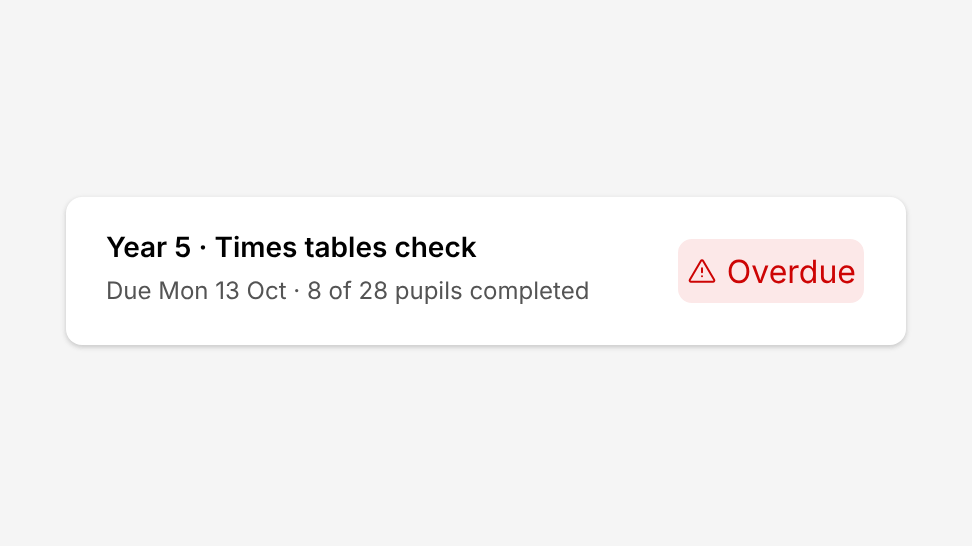
Do
Use badges to highlight important information.
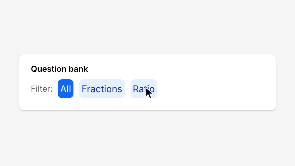
Don't
Use badges to filter a list. Use Chip Toggle Group instead.
Do
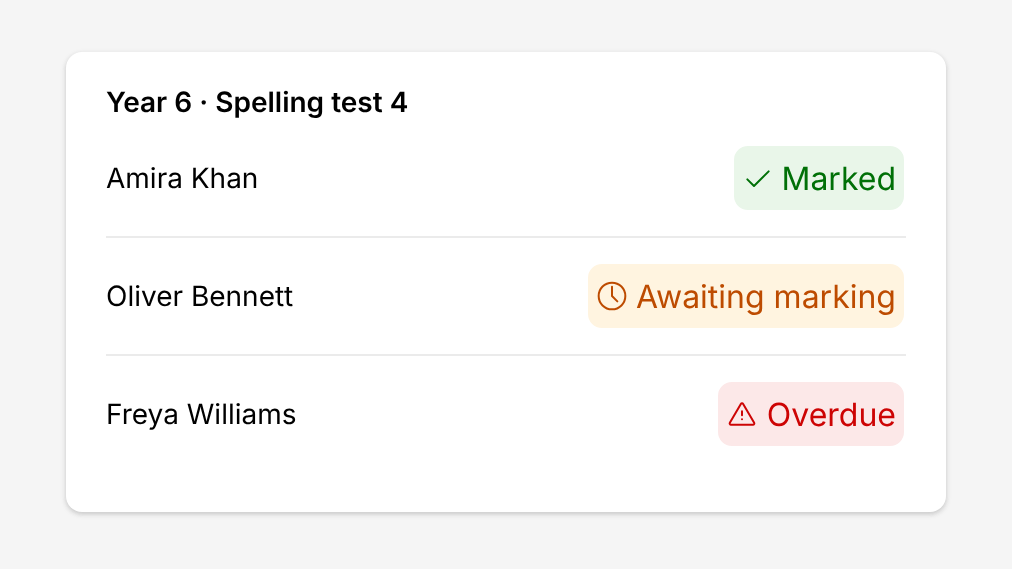
Use badges for short, scannable status.
Don't
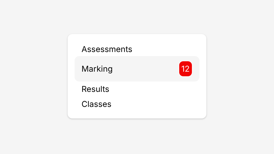
Show a count on a navigation item. Use Notification Badge instead.
Do
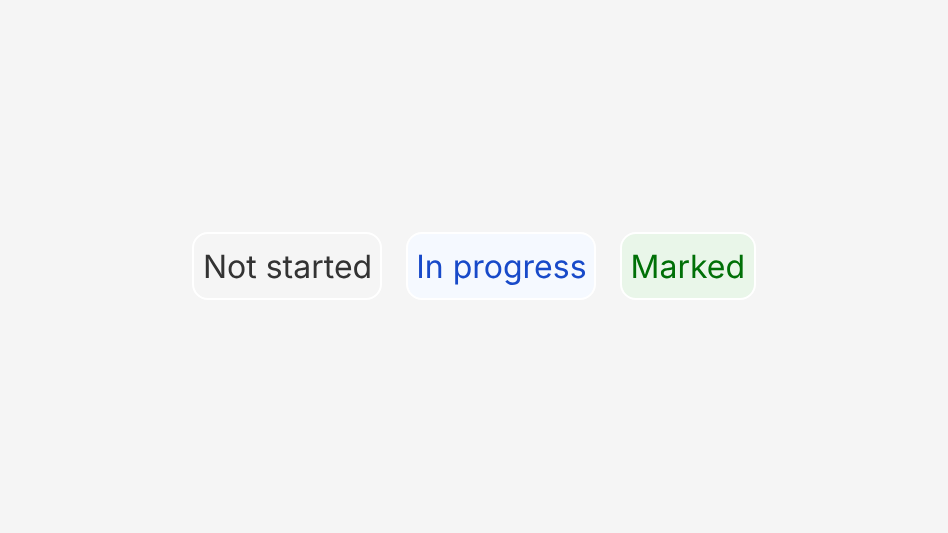
Keep labels to one or two words, in sentence case.
Don't
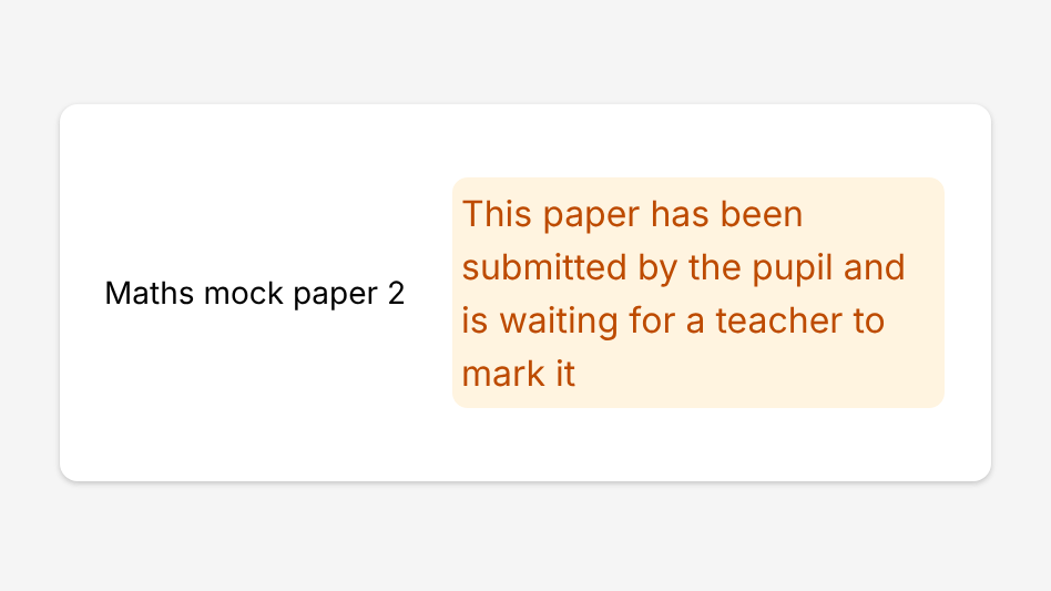
Put a sentence in a badge. Use Inline Message or helper text instead.
Choosing a theme
Semantic themes carry meaning. Use them only for status, and always with the same meaning:
| Theme | Use for | Examples |
|---|---|---|
success | Done | Marked, Completed |
warning | Needs action | Awaiting marking |
danger | Late or failed | Overdue |
info | Planned or under way | Scheduled, In progress |
neutral | Not started or inactive | Not started, Archived |
Non-semantic themes (blue, purple, teal and others) carry no meaning. Use them for categories such as topics or delivery mode, and give each category one colour everywhere it appears.
Choosing an emphasis
- Subtle (default): use it almost everywhere, including dense tables and lists.
- Bold: use it only for the single most important status on a screen.
- White: use it on grey or coloured backgrounds, where a subtle badge would blend in.
Size
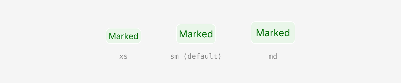
Use sm (default) in most places. Use xs in dense tables and compact cards, and md next to large headings. Use the same size for every badge in a group.
Long labels
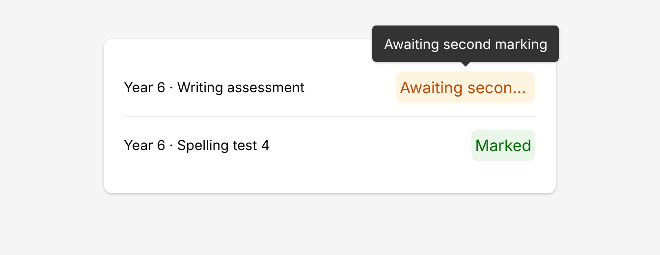
Keep labels to one or two words, in sentence case. In tables, set overflow="ellipsis" so rows keep an even height: the label is cut off and the full text shows in a tooltip. Elsewhere, labels wrap.
Clickable badges
Semantic badges are never clickable. A non-semantic badge can be, for example a topic badge that links to that topic. Give it an href or onClick and it gets a pointer and a hover style. Semantic badges ignore both.
Accessibility
- Never rely on colour alone. The label must make sense without its colour. Add an icon to semantic statuses.
- Keep labels short. One or two words. In tables, use
overflow="ellipsis"so the full label is still available in a tooltip.
Structure and spacing

| Property | Token | px | rem |
|---|---|---|---|
| Border radius | radius-md | 8px | 0.5 |
| Border | white | 1px | - |

| Property - size | Token | px | rem |
|---|---|---|---|
| Height - md | - | 38px | - |
| Height - sm | - | 34px | - |
| Height - xs | - | 27px | - |
| Padding x - md | space-2 | 8px | 0.5 |
| Padding x - sm & xs | space-1 | 4px | 0.25 |
| Padding y - md | space-1 | 4px | 0.25 |
| Padding y - sm | space-0.5 | 2px | 0.125 |
| Padding y - xs | - | 0px | 0 |
| Icon size (all sizes) | sm | 16px | 1 |
| Icon to text gap | space-1 | 4px | 0.25 |
Heights include the 1px border.
Typography

| Badge size | Family | Weight | Text size | Rem | px |
|---|---|---|---|---|---|
| md | body | 400 | md | 1rem | 16 |
| sm | body | 400 | md | 1rem | 16 |
| xs | body | 400 | sm | 0.875rem | 14 |
Colour

| Theme | Subtle text | Subtle bg | Bold text | Bold bg | White text |
|---|---|---|---|---|---|
| Info | info-mid | info-light | white | info | info |
| Neutral | grey-900 | grey-100 | white | grey-800 | grey-800 |
| Success | success-mid | success-light | white | success | success |
| Danger | danger-mid | danger-light | white | danger | danger |
| Warning | warning-text | warning-light | grey-1000 | warning | warning-text |
Non-semantic themes follow the same pattern using the -1000 step for subtle text, -200 for subtle background and -800 for bold background and white-emphasis text, with a few overrides for contrast (e.g. yellow, lime and orange use dark text on bold).
Options
| Option | In code | Values | Default |
|---|---|---|---|
| Theme | theme | 5 semantic and 17 non-semantic colours | info |
| Emphasis | emphasis | subtle, bold, white. Can change by breakpoint. | subtle |
| Size | size | xs, sm, md. Can change by breakpoint. | sm |
| Overflow | overflow | wrap, ellipsis (shows a tooltip when cut off) | wrap |
| Icon | Badge.Icon | Any icon, before or after the label | None |